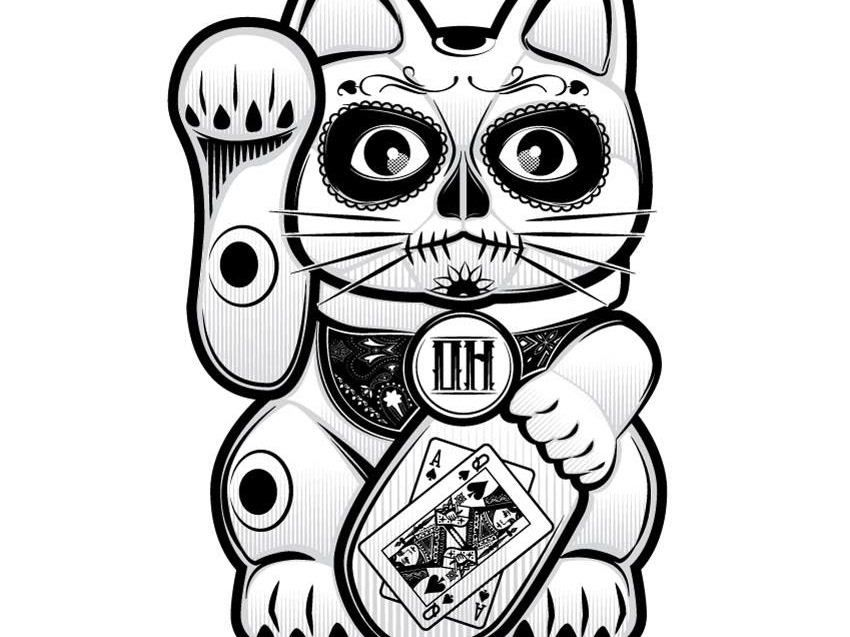
When I begin a new branding project I will generally submit three different logo concepts for client approval (I almost always make many more). This project was for a new casual dining vegan restaurant in Madison, Wisconsin called The Mad Rabbit Cafe. The client asked to draw inspiration from the movie poster for the film Natural Born Killers. The client was happy with the initial concepts.
Nathaniel Anger- "Good Morning, Ed! Love love love the first drafts. I feel like you really get it haha"
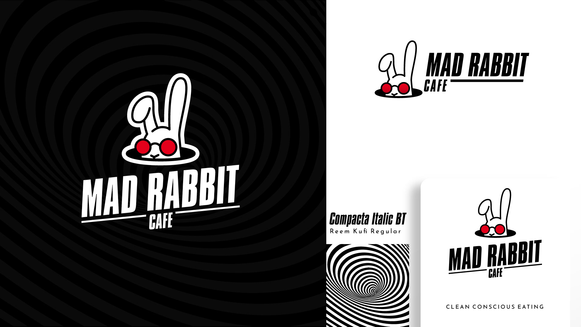
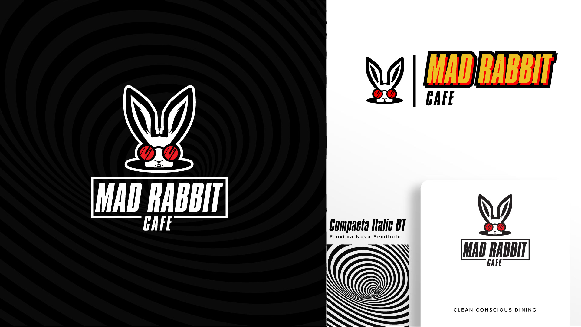
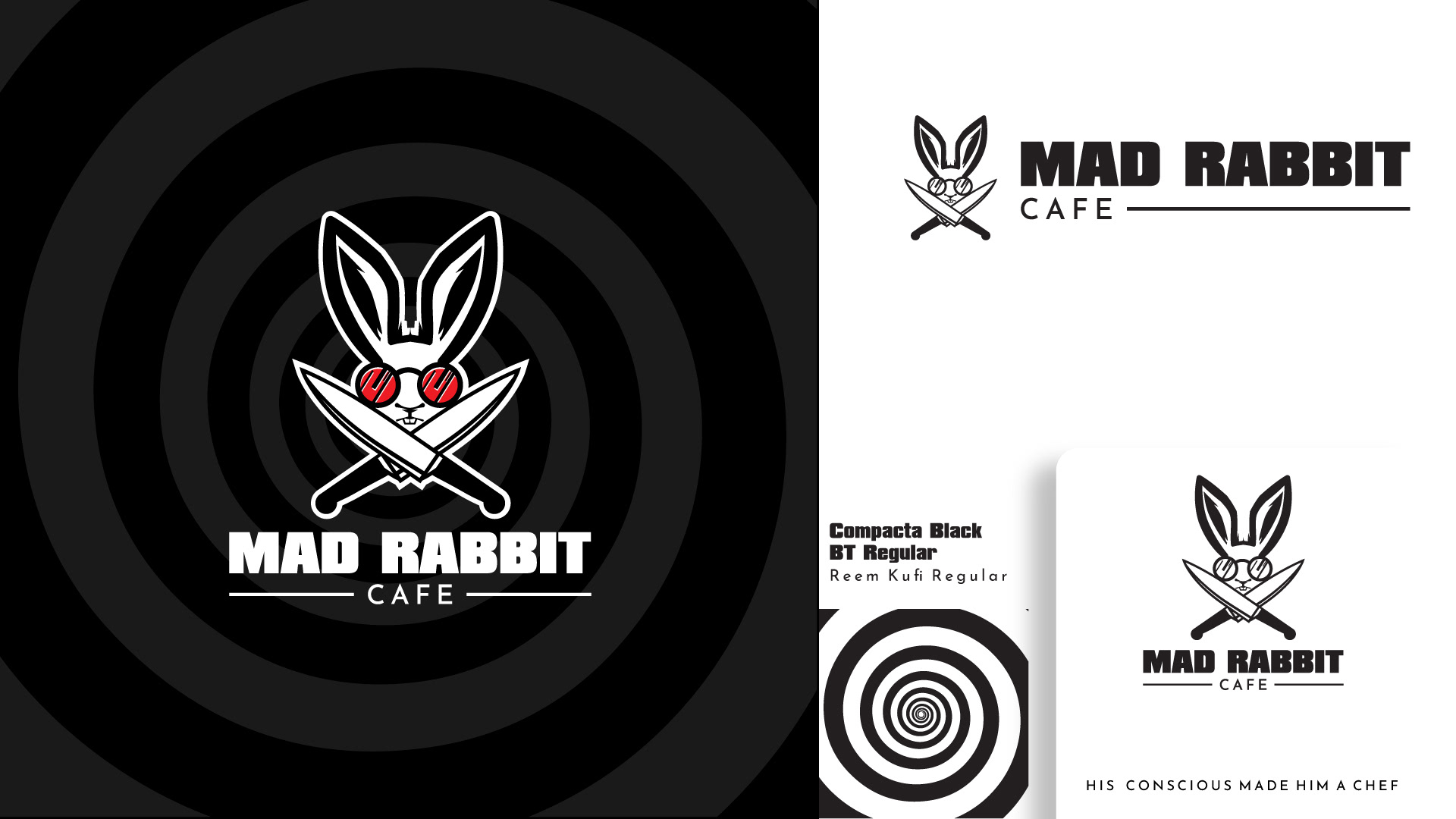
After a few changes, this is the version that was chosen for development
The Caregivers Dashboard was developed to guide, inform, and empower caregivers of cancer patients by providing tools that help to create a road map of treatment, improve communication, and encourage greater involvement and engagement. I am really honored to be able to work on this project. I set out to create an identity package that was hopeful and compassionate. These are the three concepts that I presented to the client.
This is the concept that was chosen and some of the pages from the brand guidelines for The Caregiver's Dashboard.
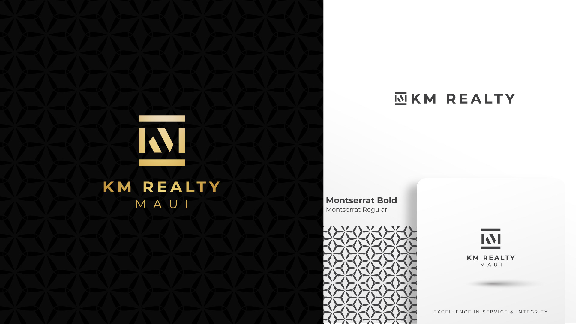
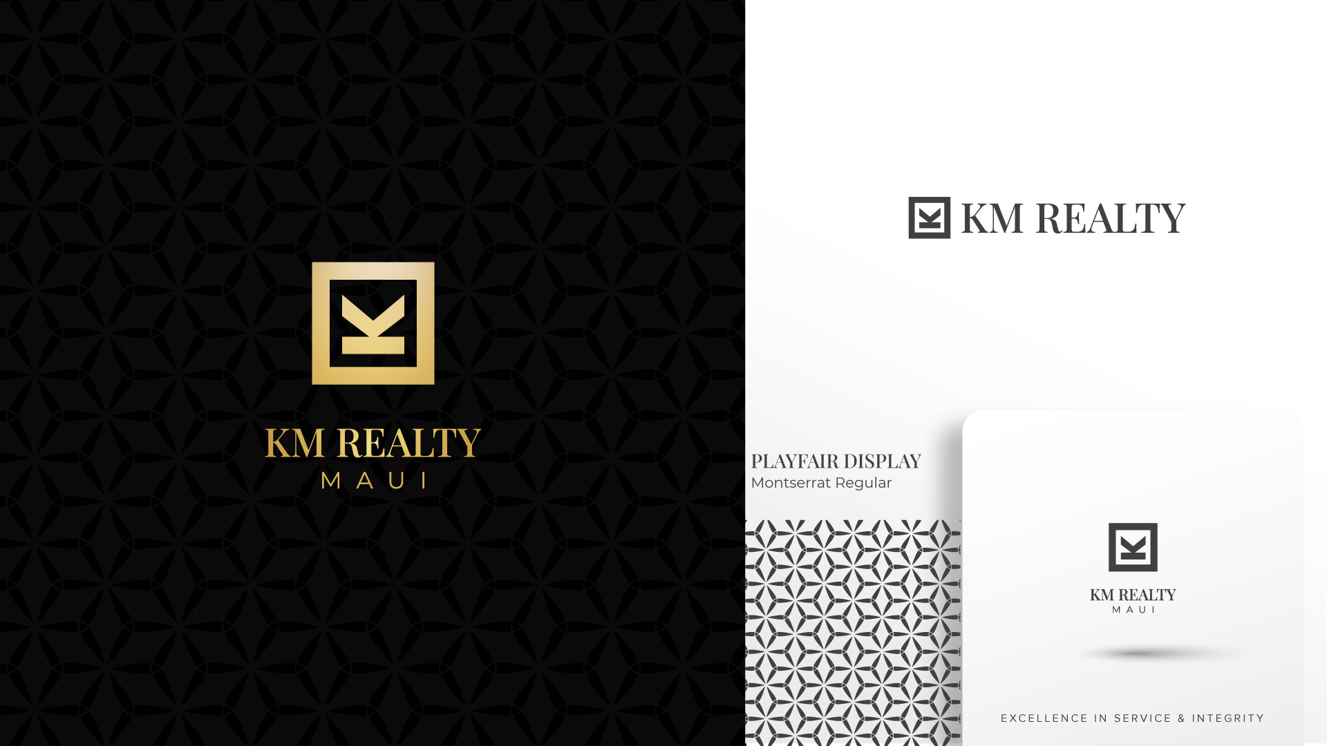
This branding package was an opportunity to create an upmarket Real Estate Identity Package for KM Realty. KM Reality is positioned to be the Premium Brokerage and Rental Management brand in the highly exclusive market of Maui, Hawaii. Their growth plan is to expand to many of the other premium resort destinations in the US. For this reason, it was imperative to create a scaleable Brand Identity they could grow with.
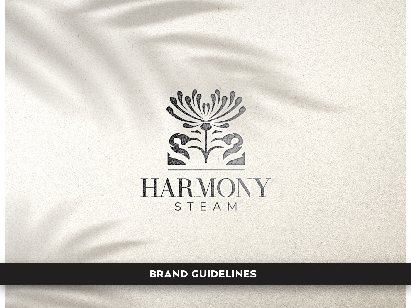
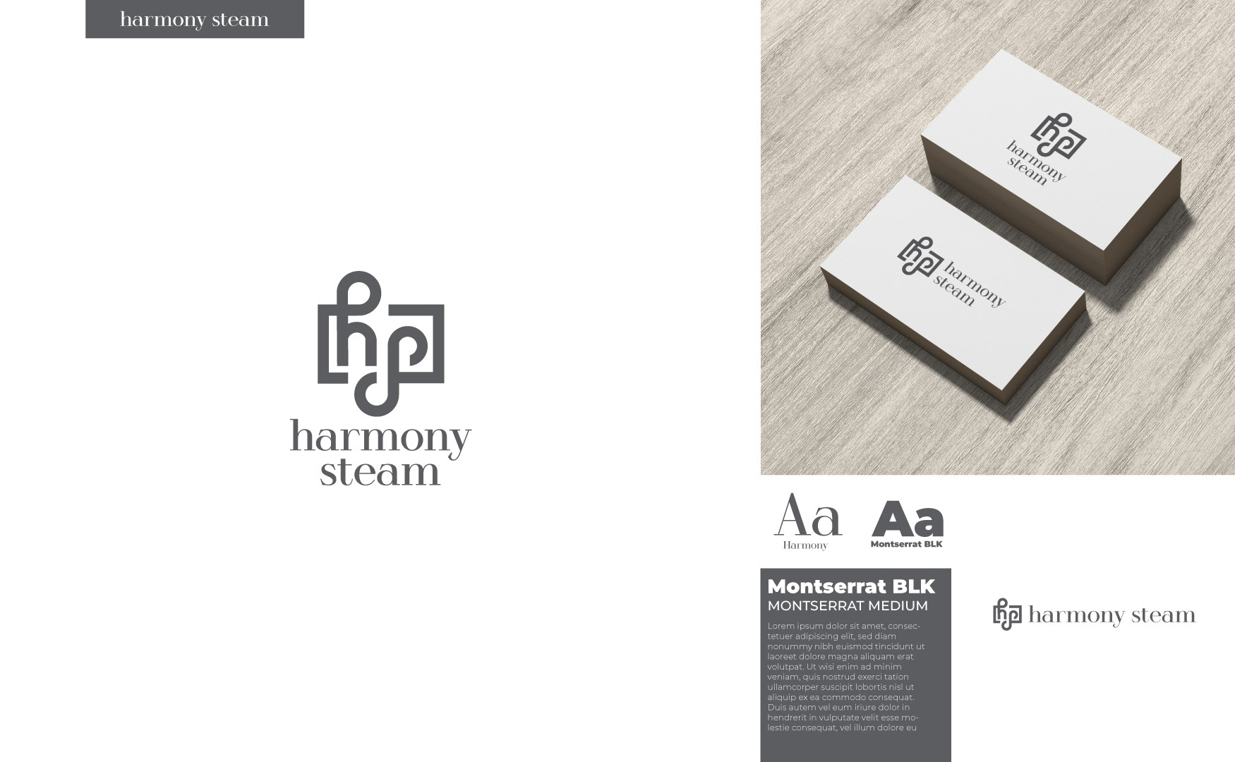
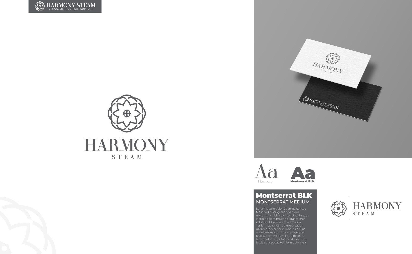
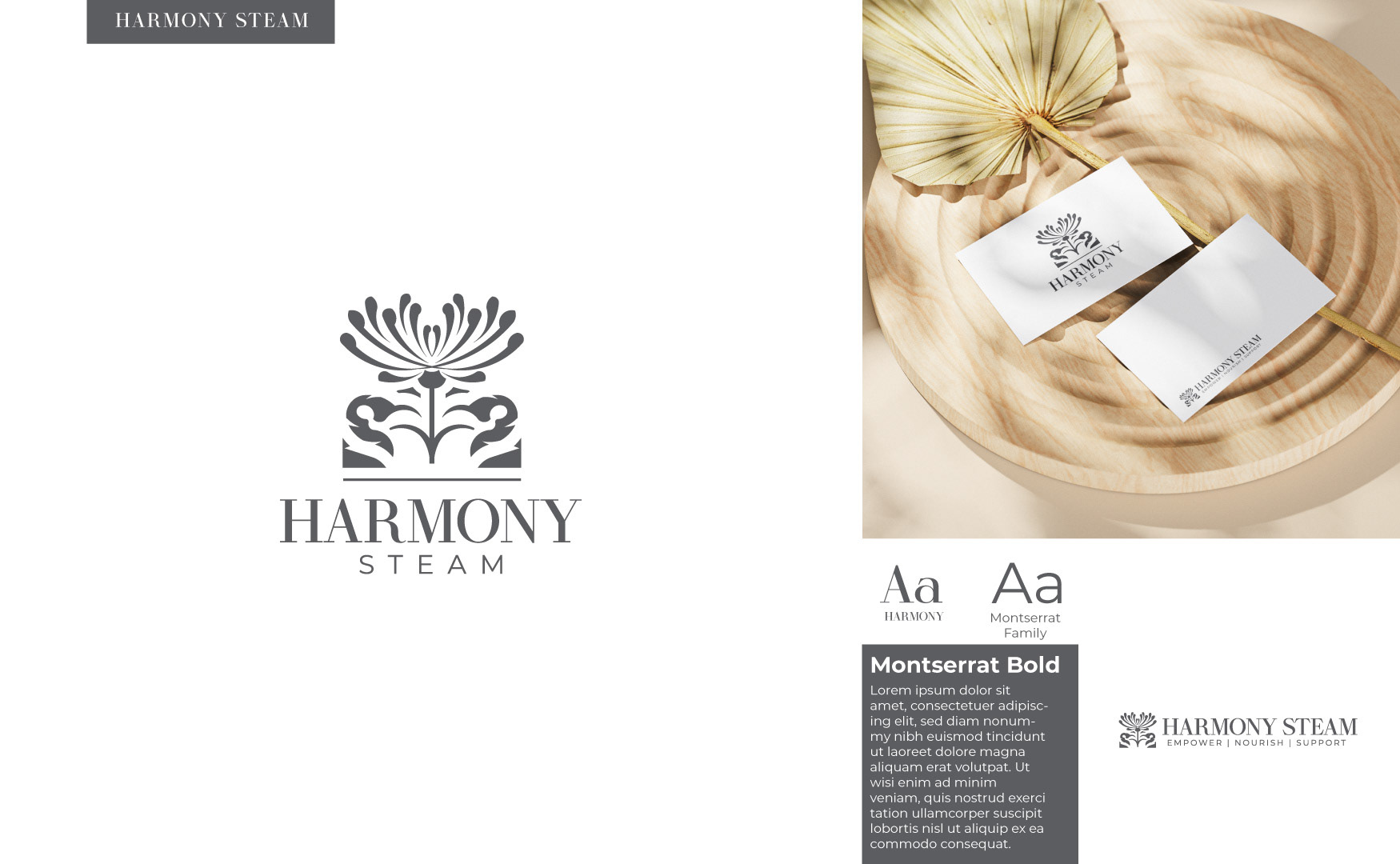
For the Harmony Steam project, I was tasked with the creation of a logo for a holistic up-market brand that provided pelvic steaming treatments. The client had an affinity for chrysanthemum flowers. The complete brand standards package is displayed in another section here on my website.
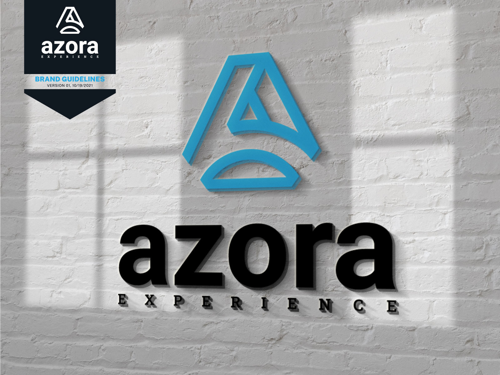
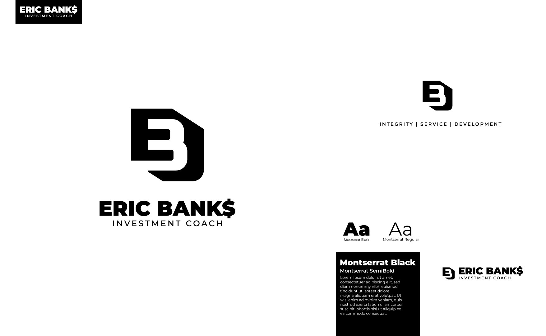
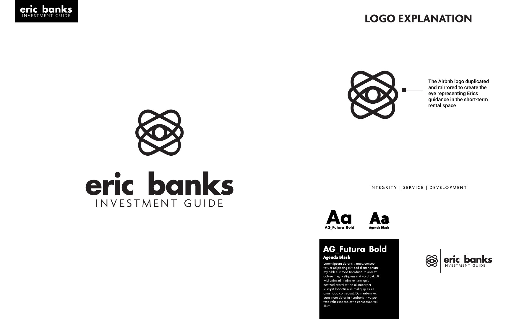
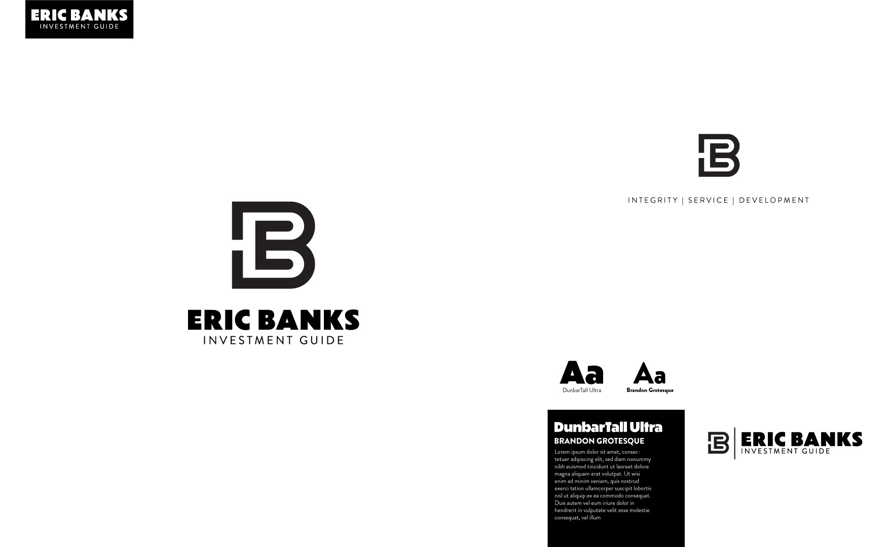
Eric Banks is an investment coach in the short-term vacation rental space. This is a branding package I created while working with a marketing agency start-up called The Azora Experience.
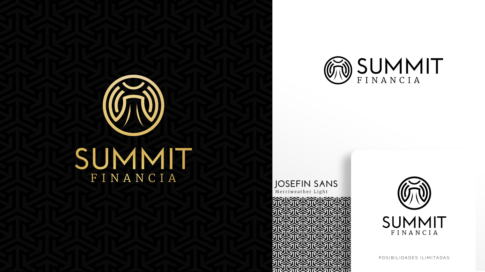
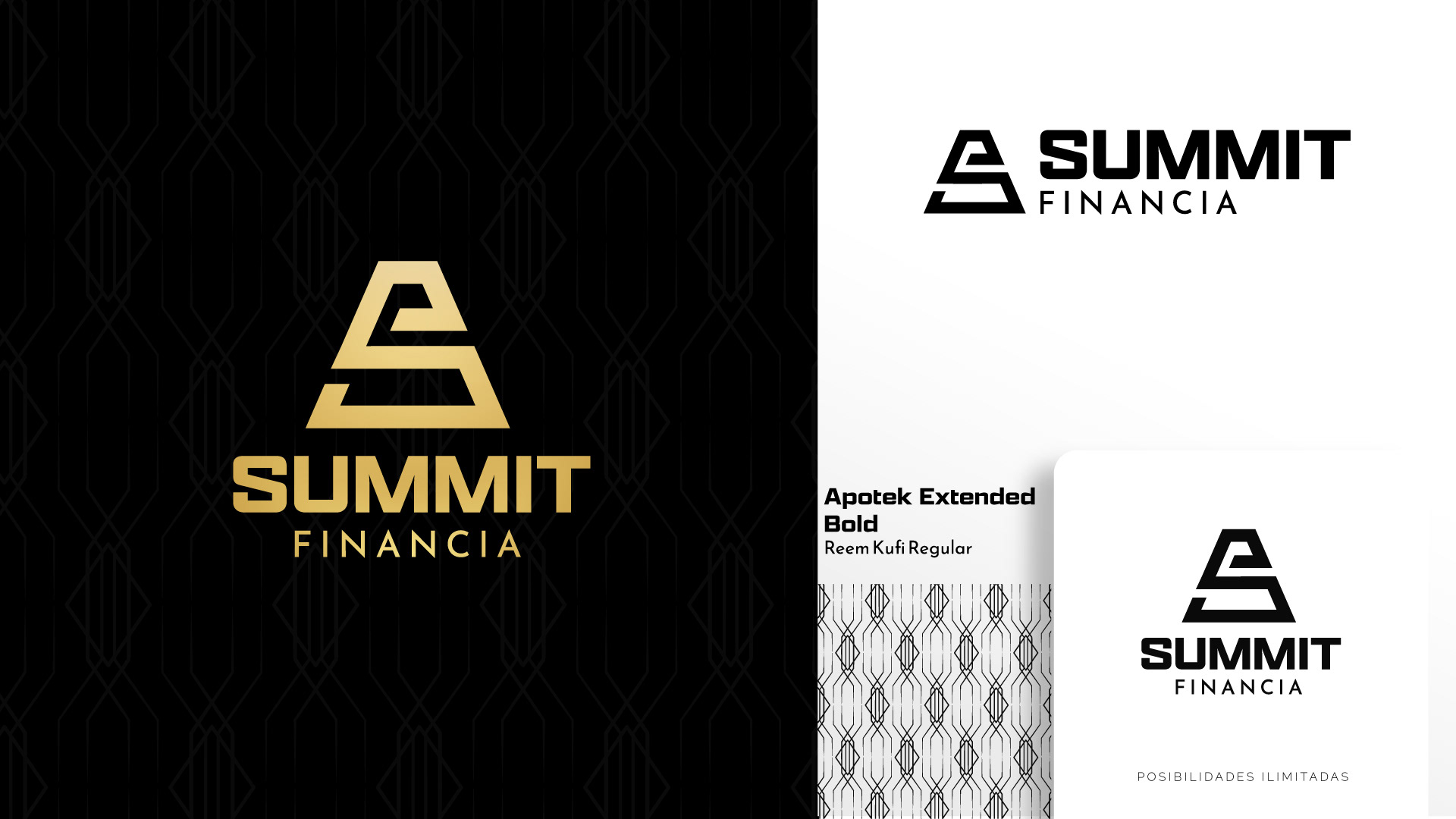
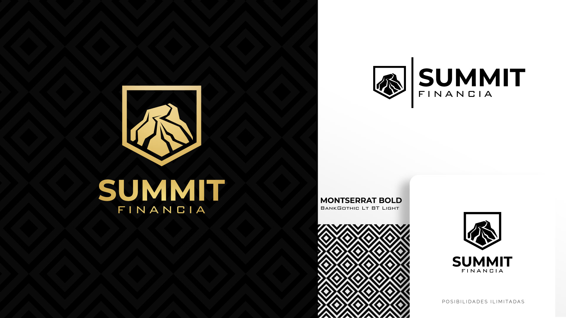
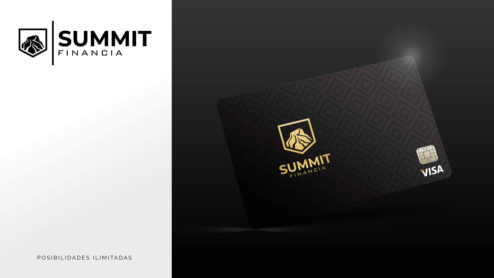
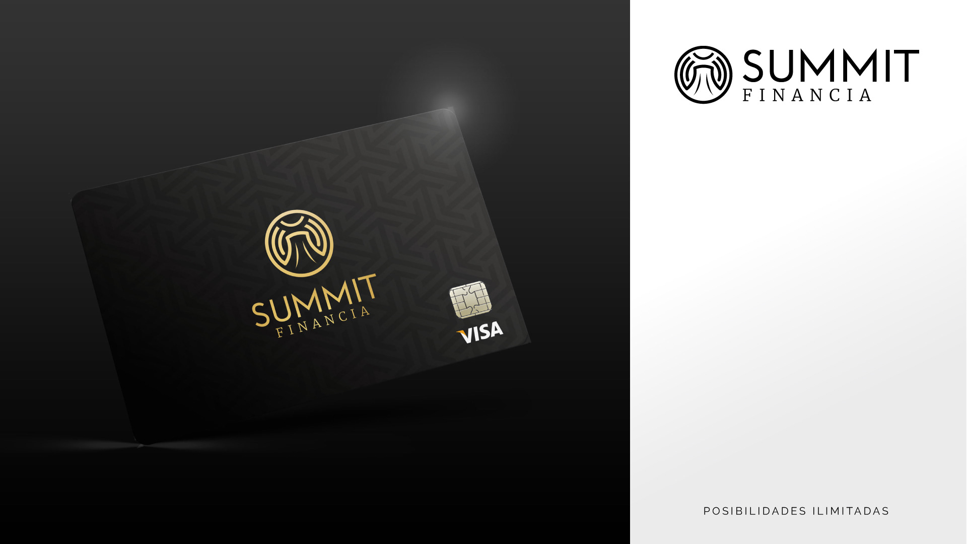
I created this upmarket credit card concept pitch for an investment/credit group in Panama called Financia Credit. Their goal was to provide a user-set limit credit card for their gold-class clients. I wanted to create something sexy, and luxurious. I of course started with the American Express Black Card as my aesthetic barometer.
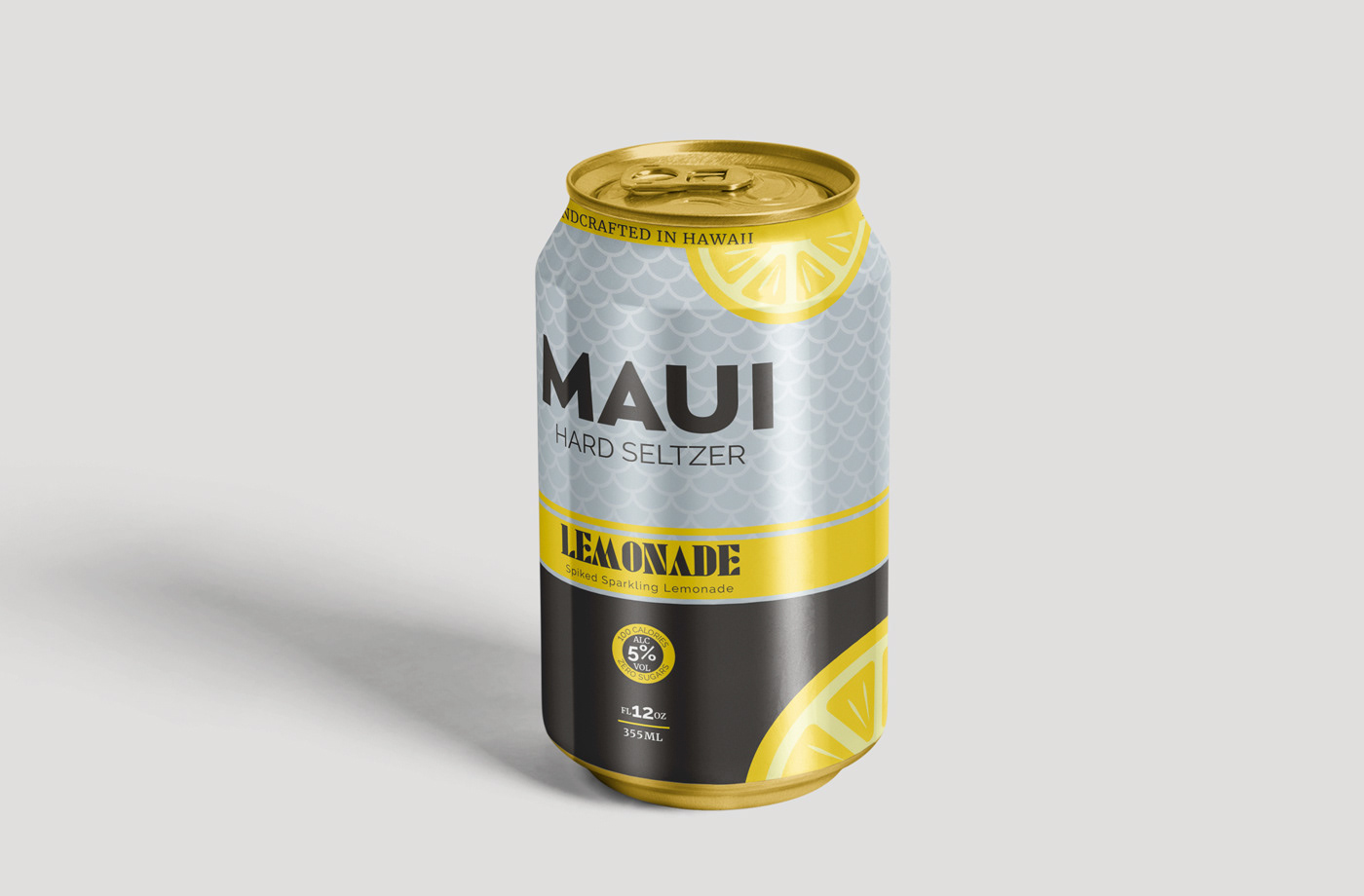
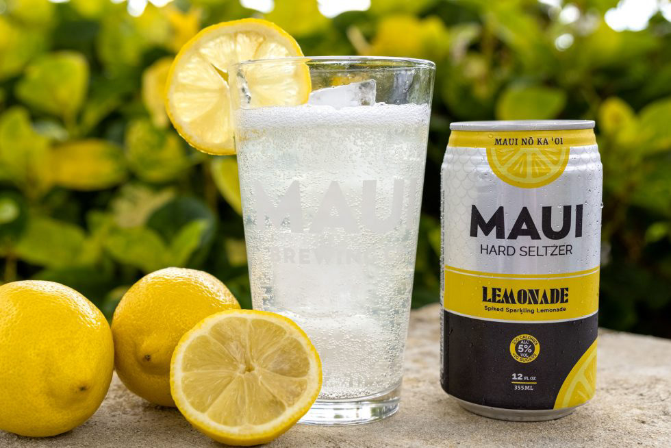
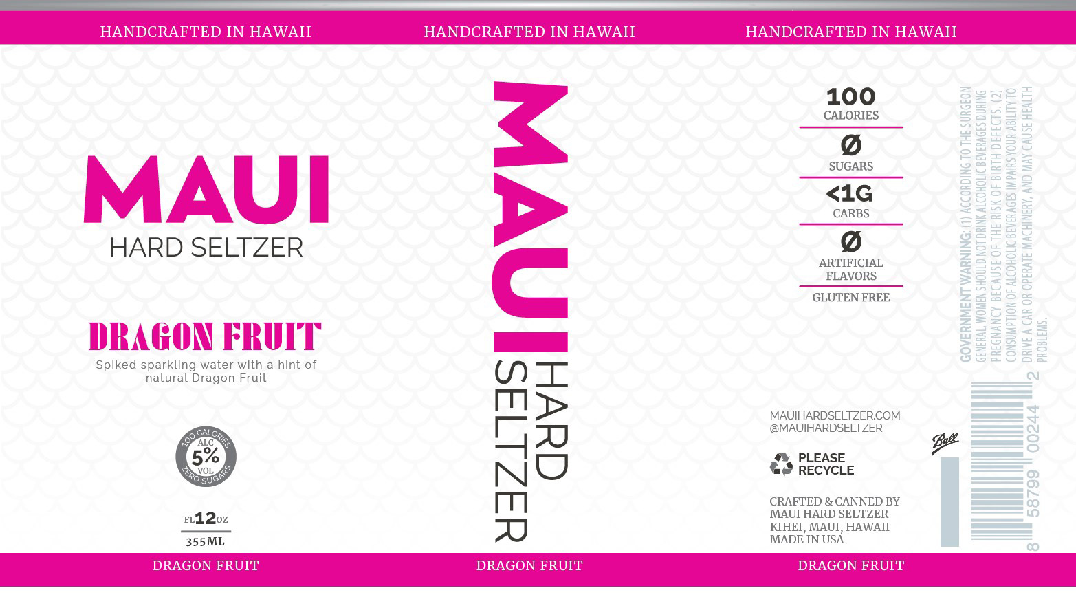
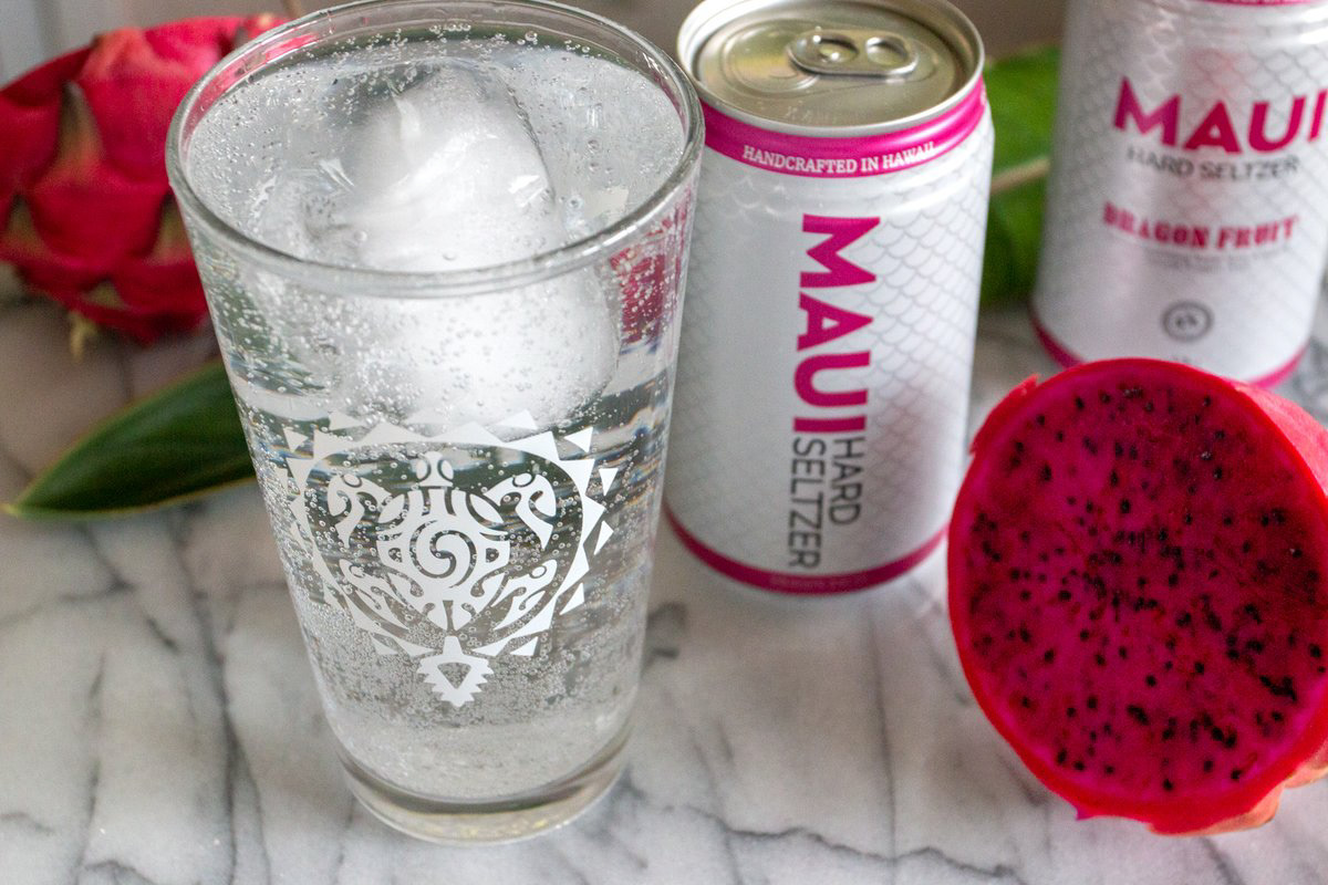
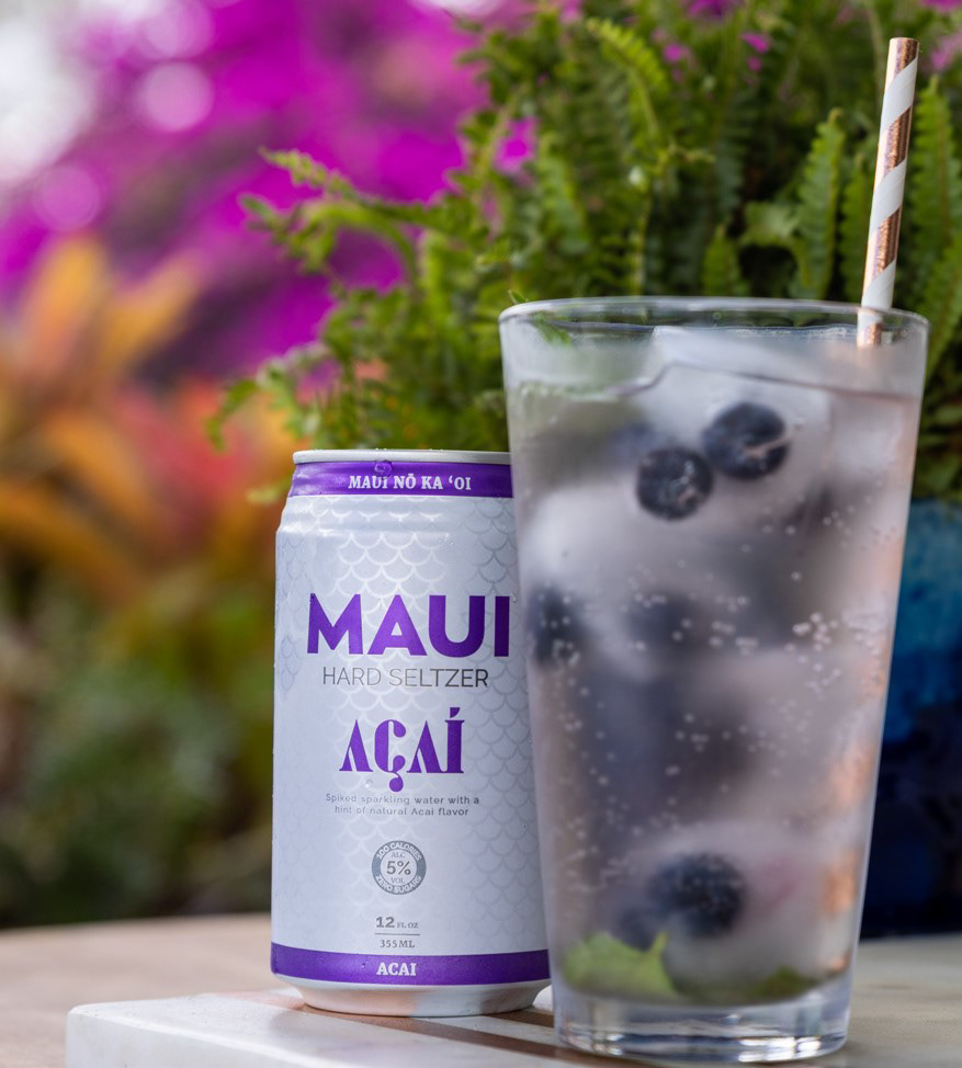
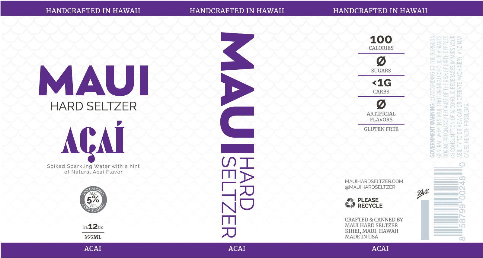
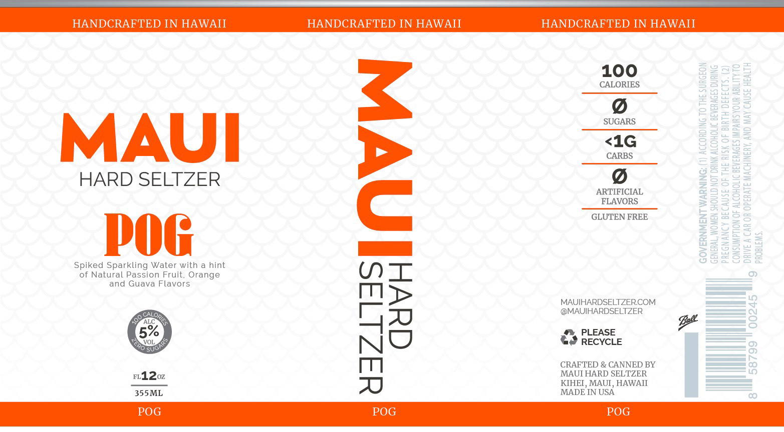
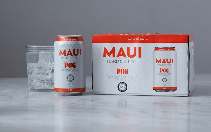
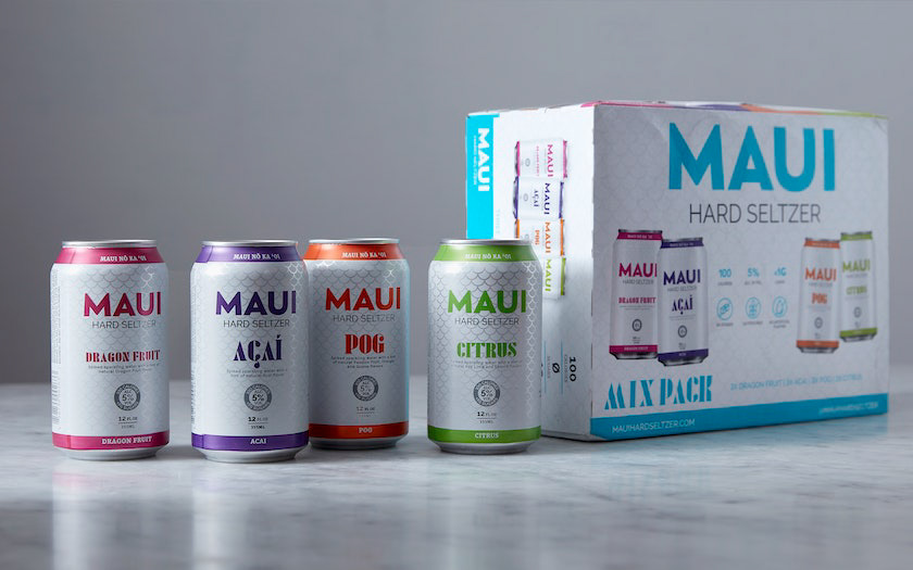
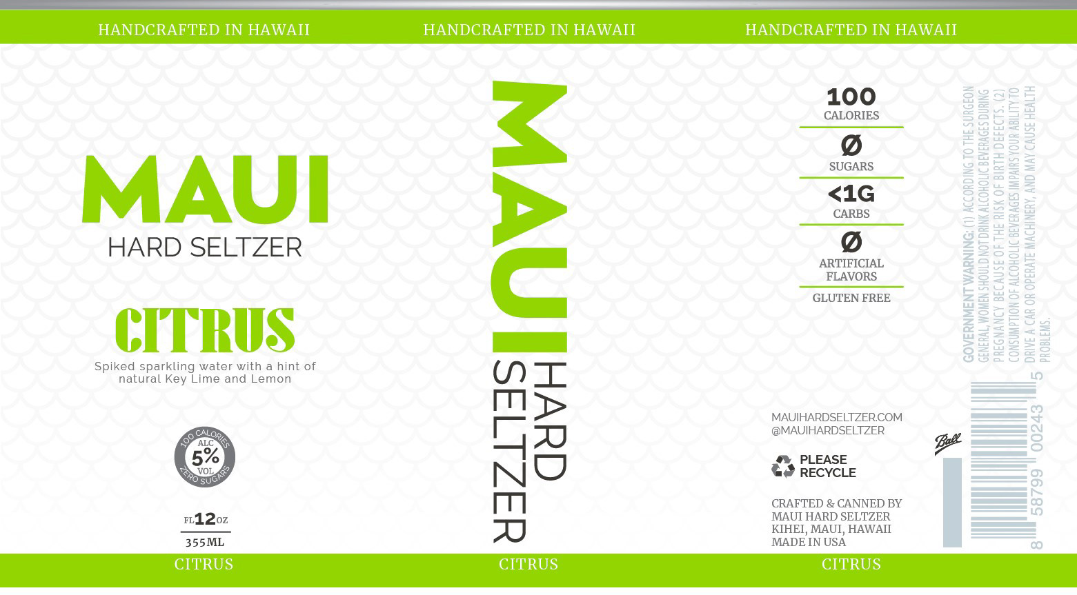
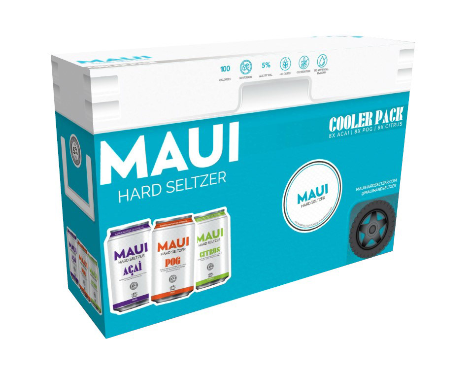
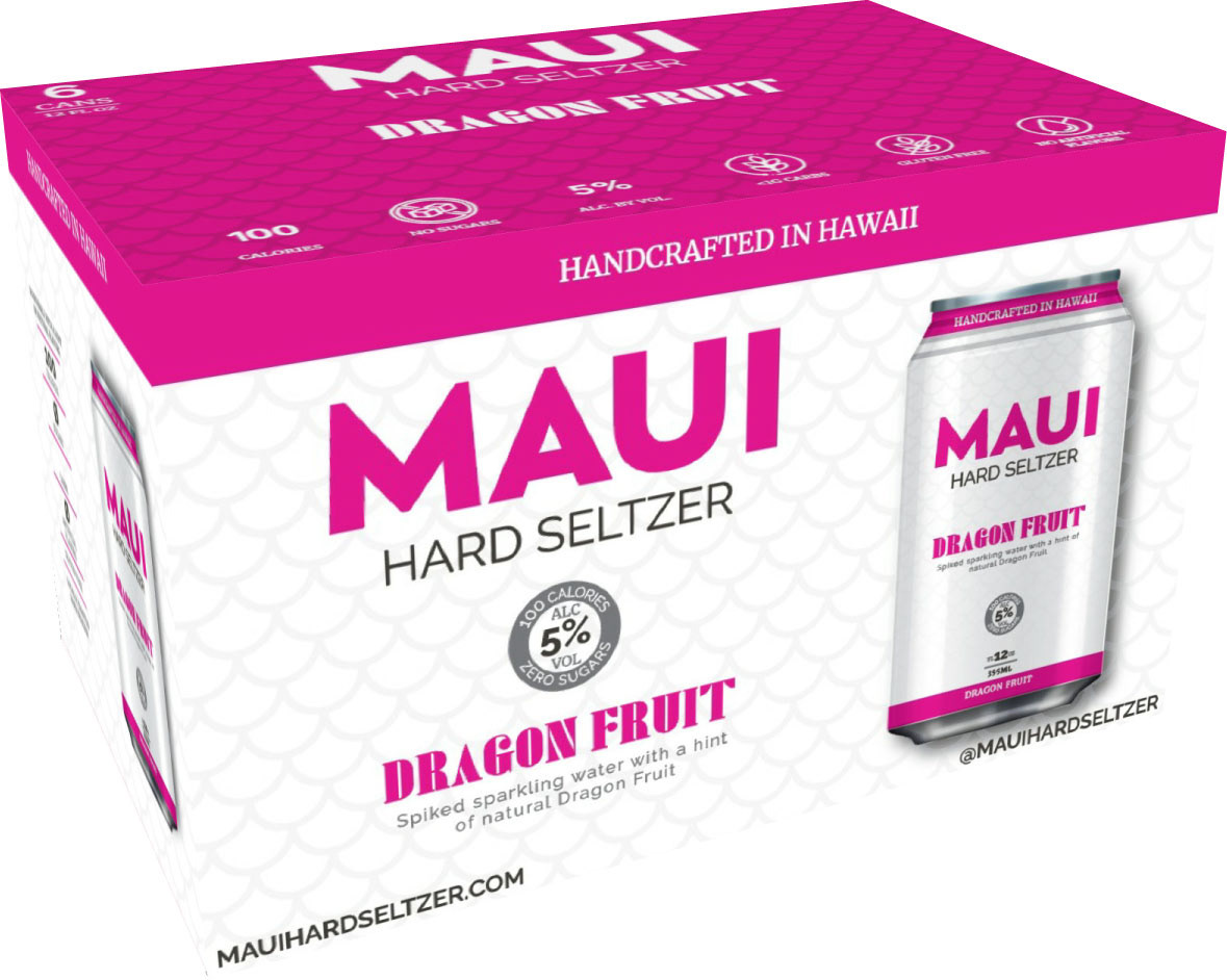
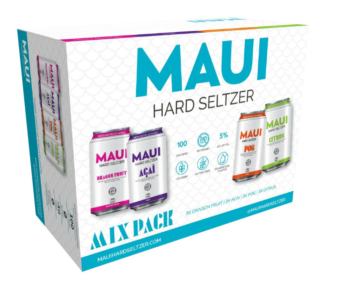
During my time with Maui Brewing Co, I was mostly working under the branding decisions of another creative both before and after the re-branding that occurred in 2016. I was given the opportunity to create a new brand of Hard Seltzers called Maui Hard Seltzers. They had originally wanted to call the brand Olu Hard Seltzer but changed direction once finding that there was another brand being produced on the Big Island with a very similar name, Ola Hard Seltzer. It's kind of funny because one of my concepts looks very similar to the Ola brand even though I had never seen anything from that brand. In the end, it was decided to call the brand Maui Hard Seltzer and to use the wordmark from Maui Brewing Co. as the logo mark.
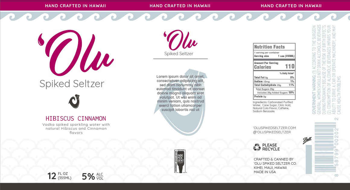
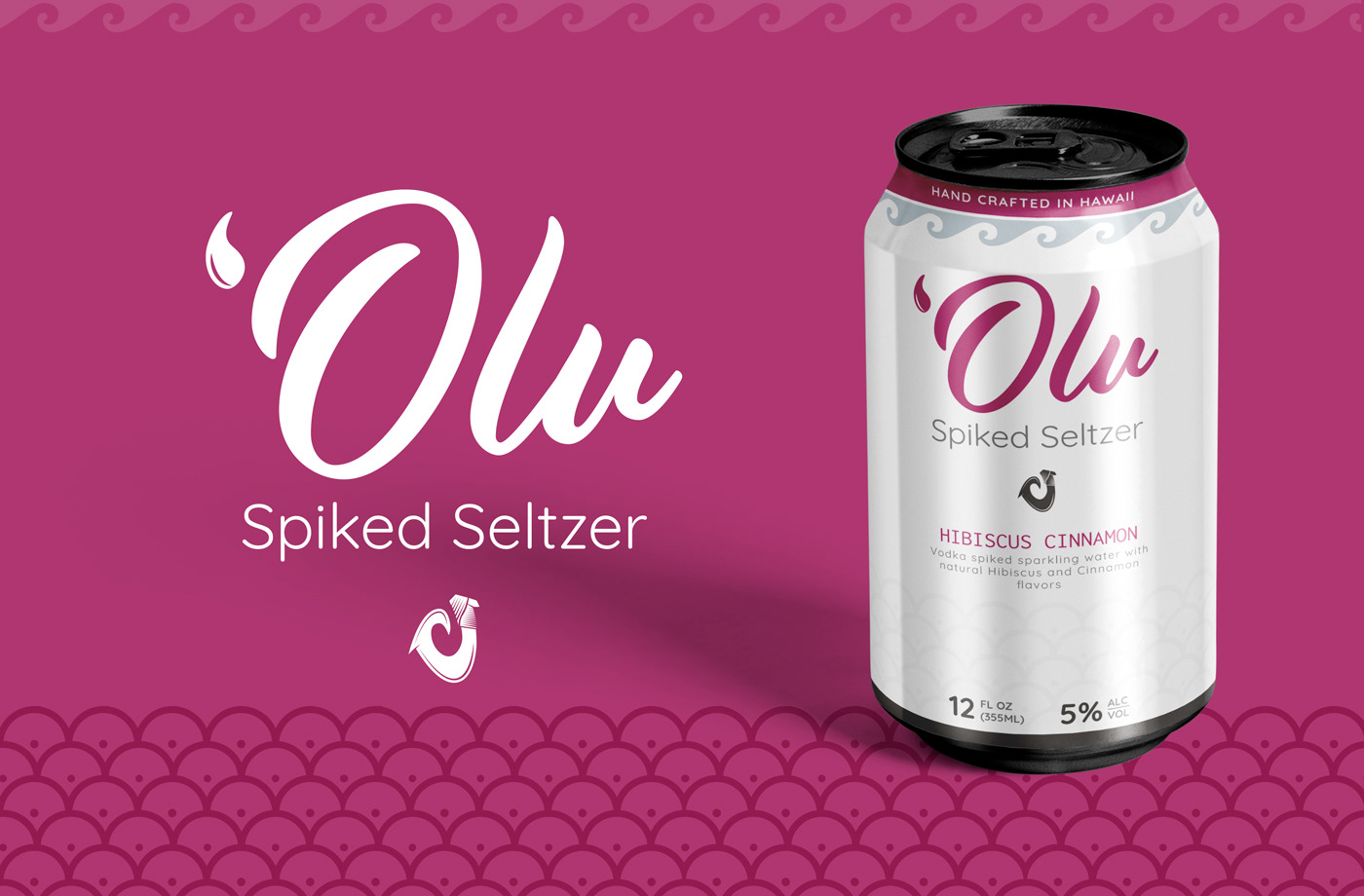
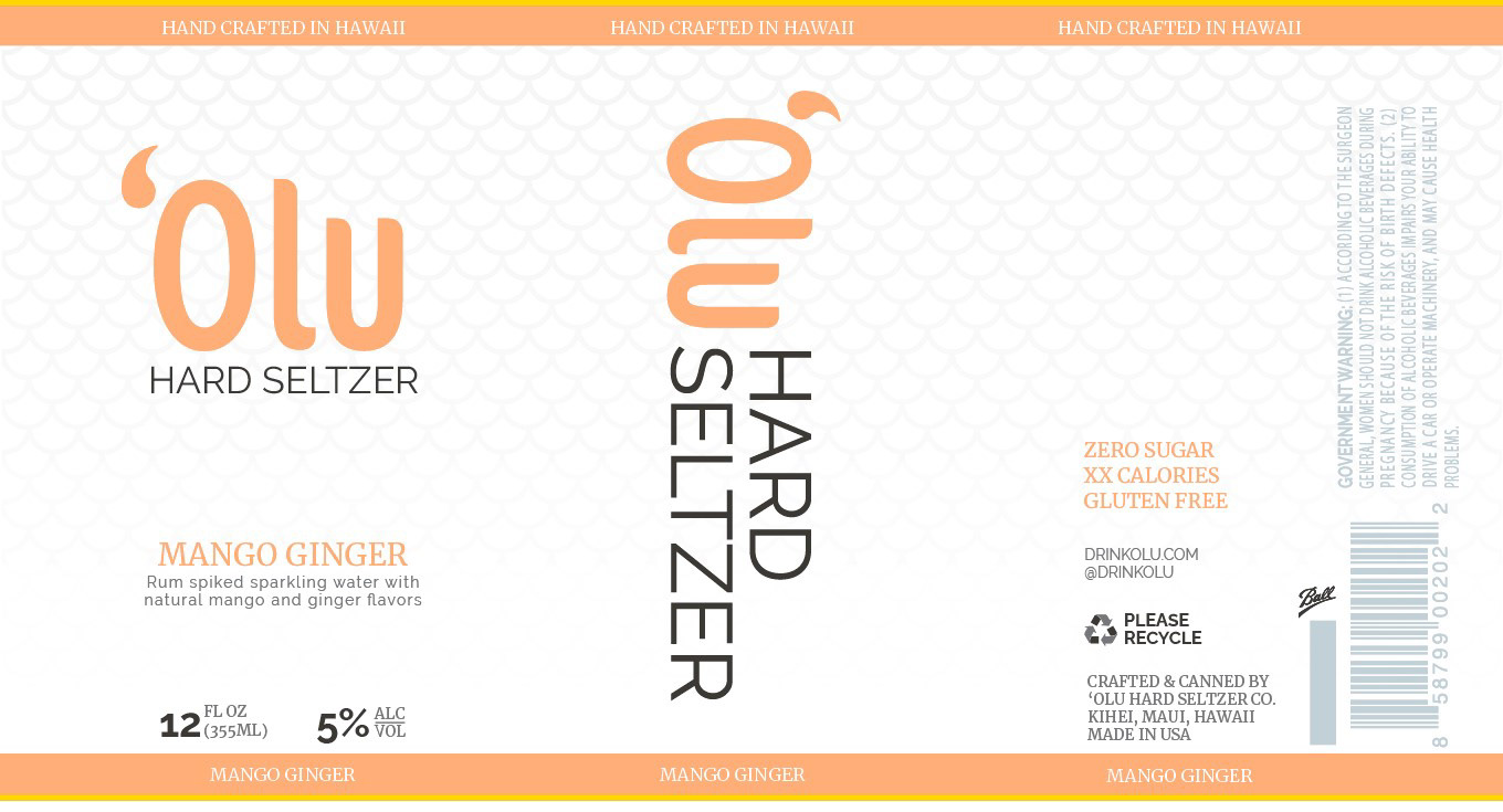
These are the two initial concept pitches.
This is the final design and line of products
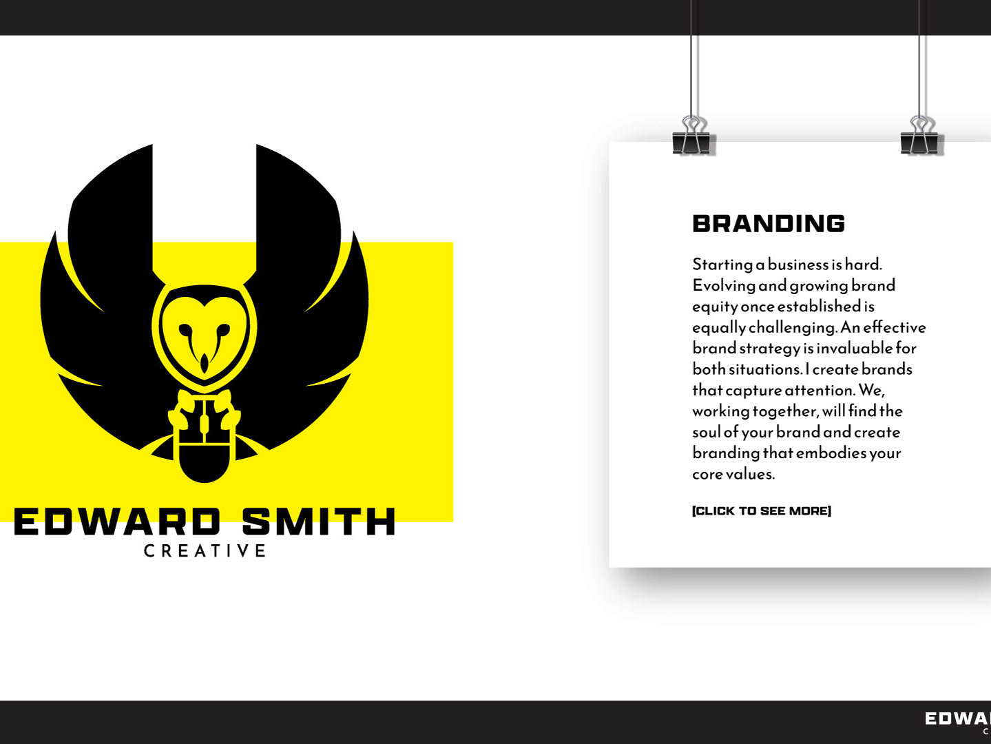
This is the logo concept for my own personal brand Pursuant Creative Agency. The owl is one of my favorite animals and I love the qualities they represent. A creature of great integrity, its quiet demeanor accords it an air of mystery and diffidence, and it is widely recognized as a serene, wise observer of human society.
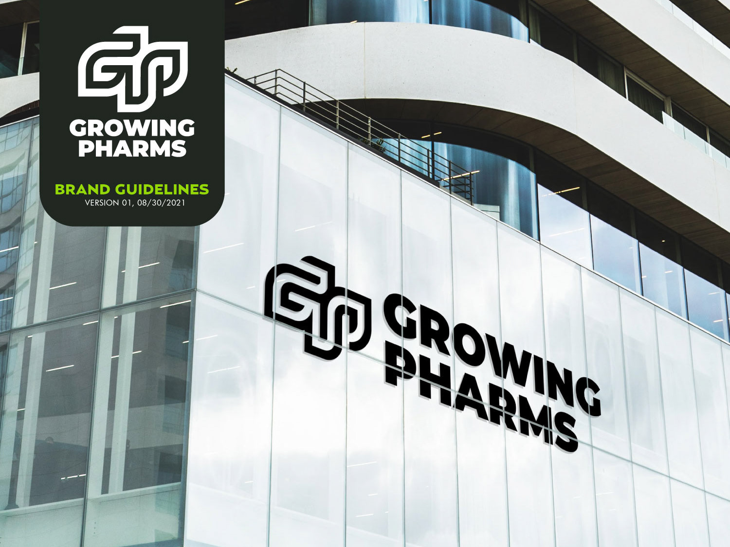
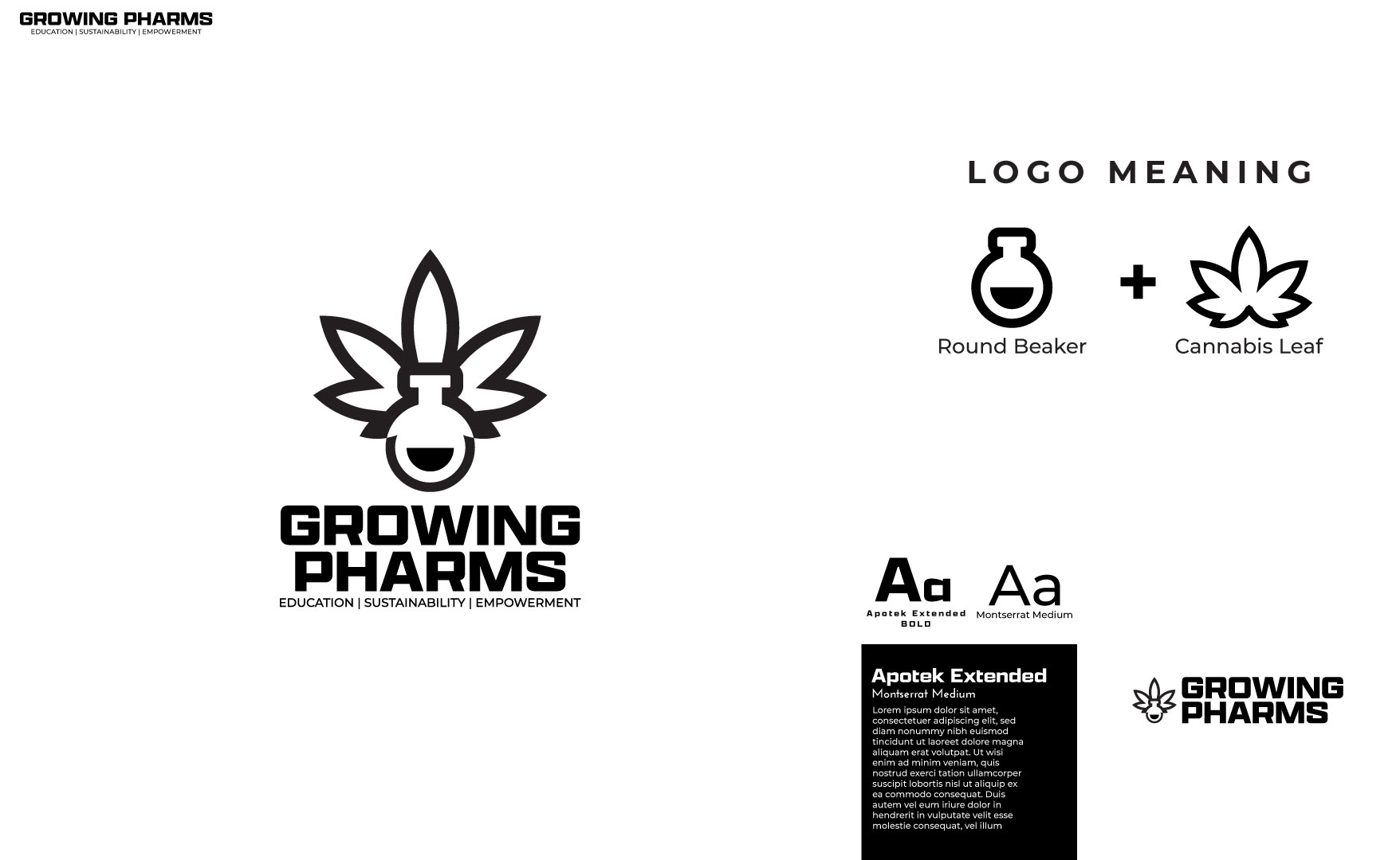
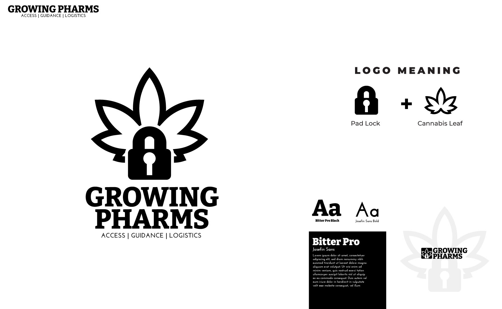
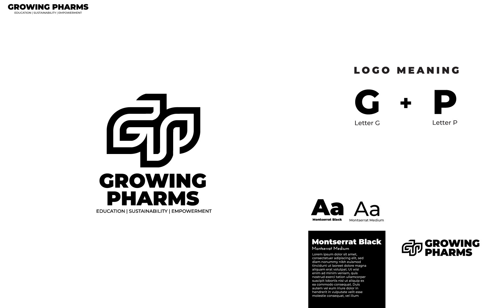
This is another branding project I created while with The Azora Experience. Growing Pharms is a subscription that gives guidance and provides a license to operate legally in the cannabis industry through existing treaties they hold with the US Government. If you would like to see the full brand package it is here.
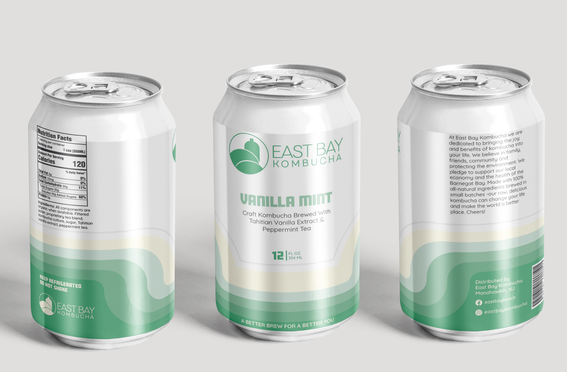
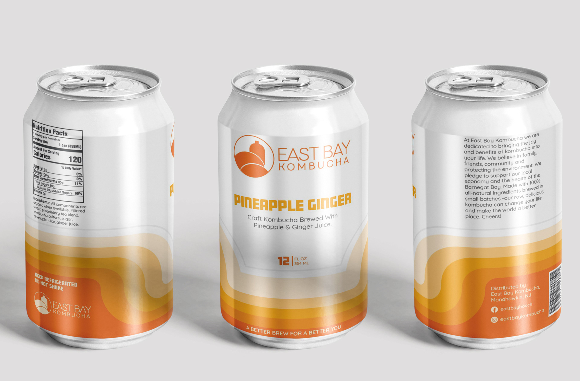
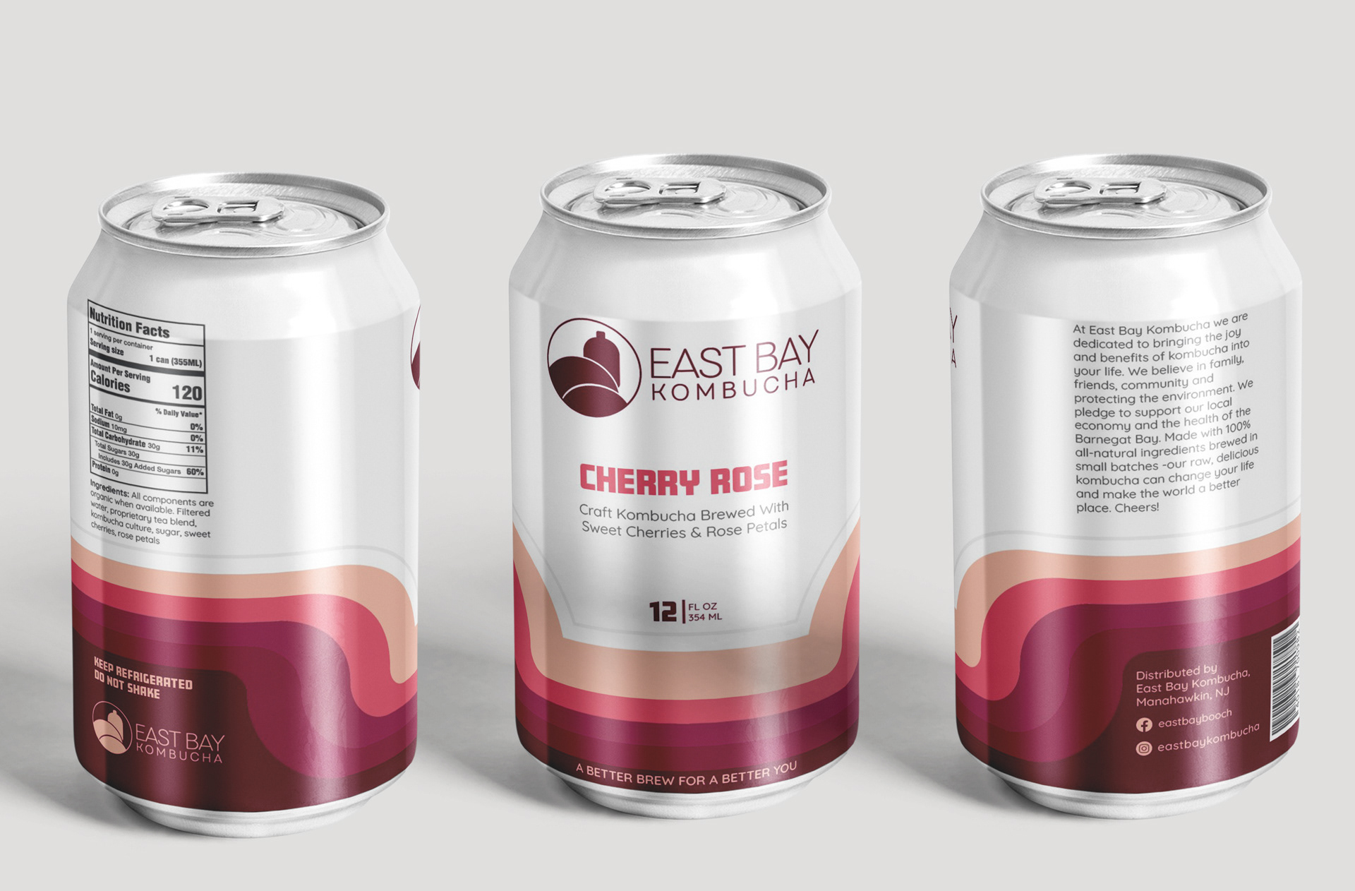
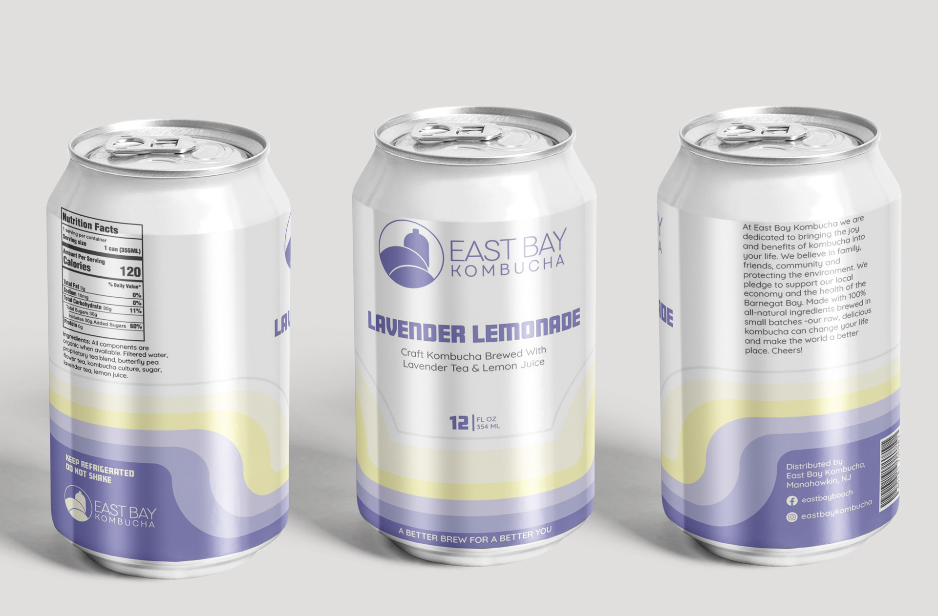
This project is an example of working within the existing branding of a client. This is not my logo work. I was tasked with the concept creation for a line of Kombuchas. The client wanted a 70s retro aesthetic. What follows is the four concepts I created for client selection.
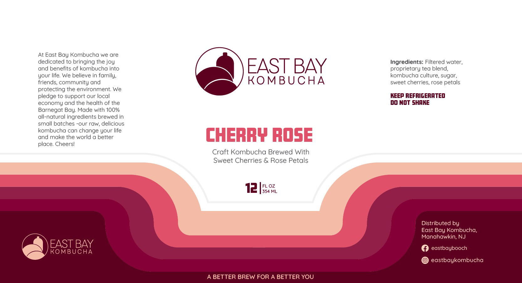
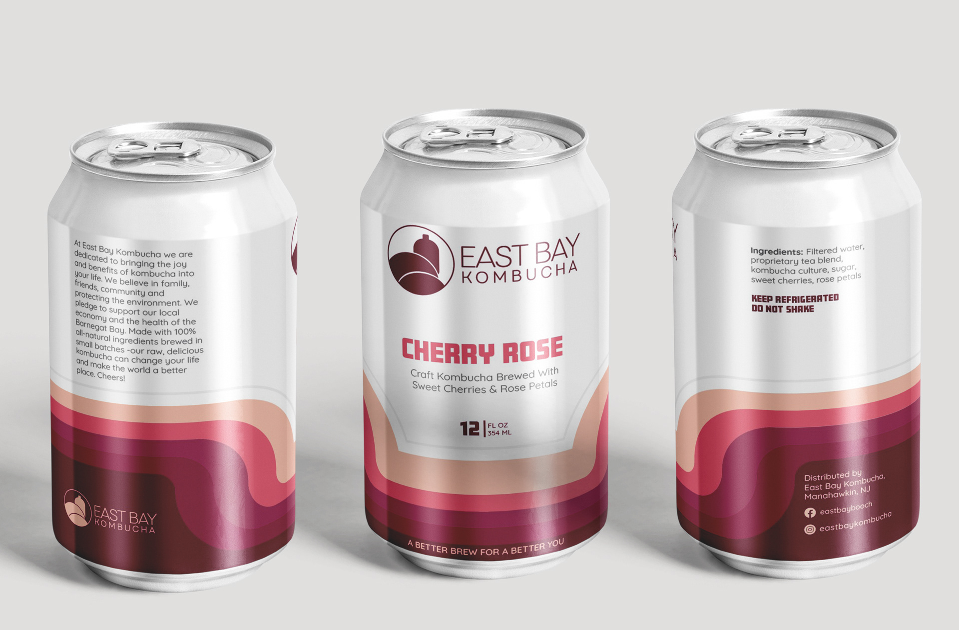
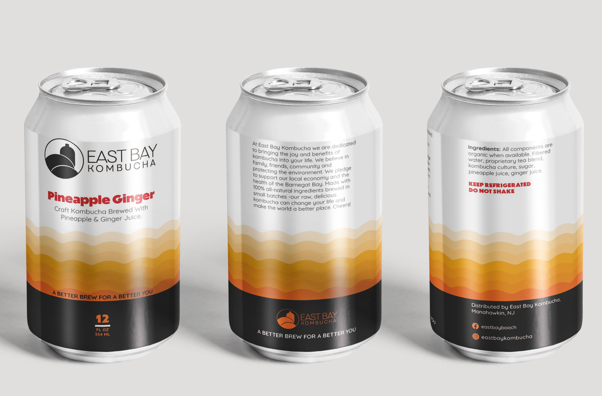
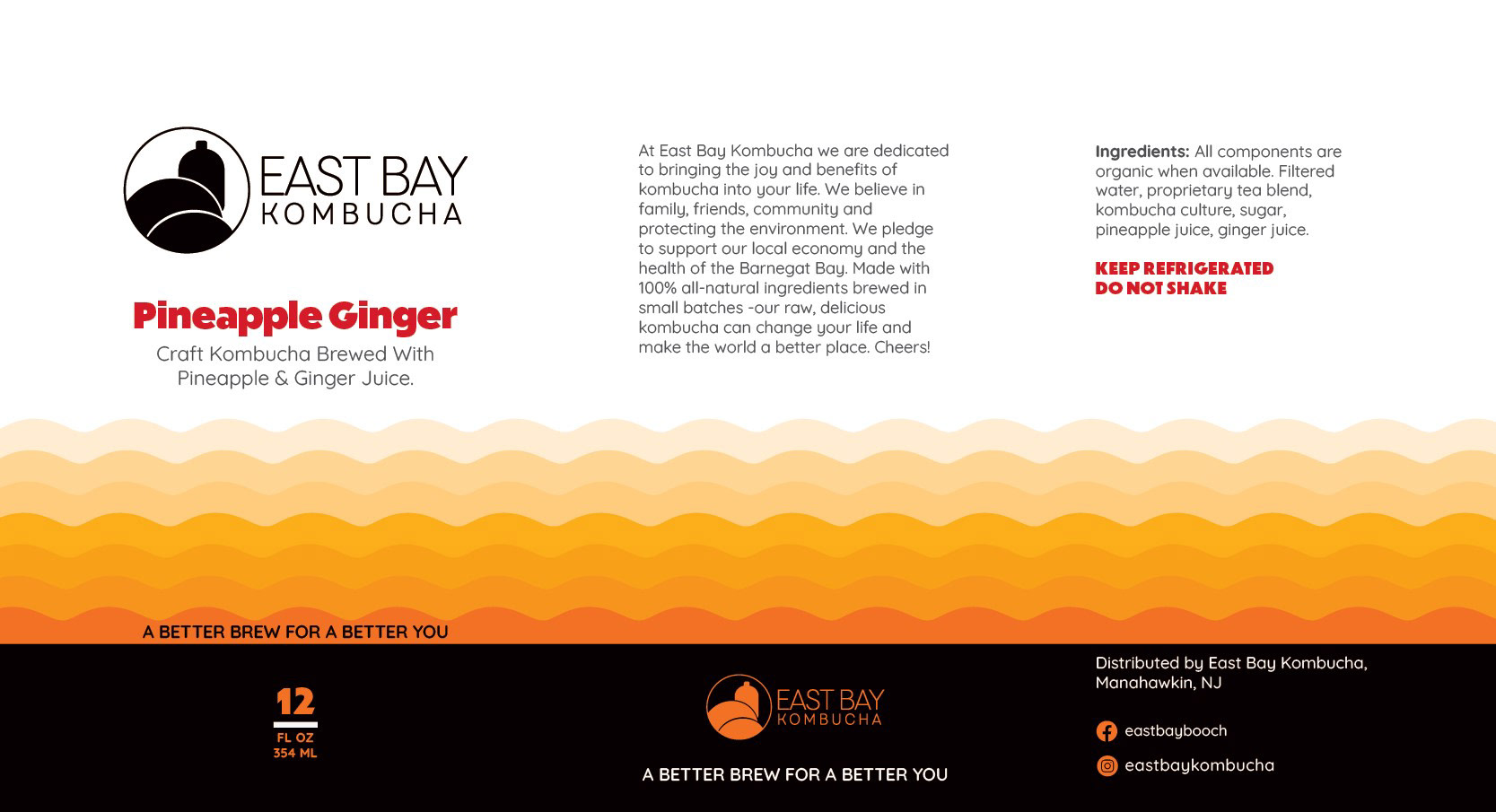
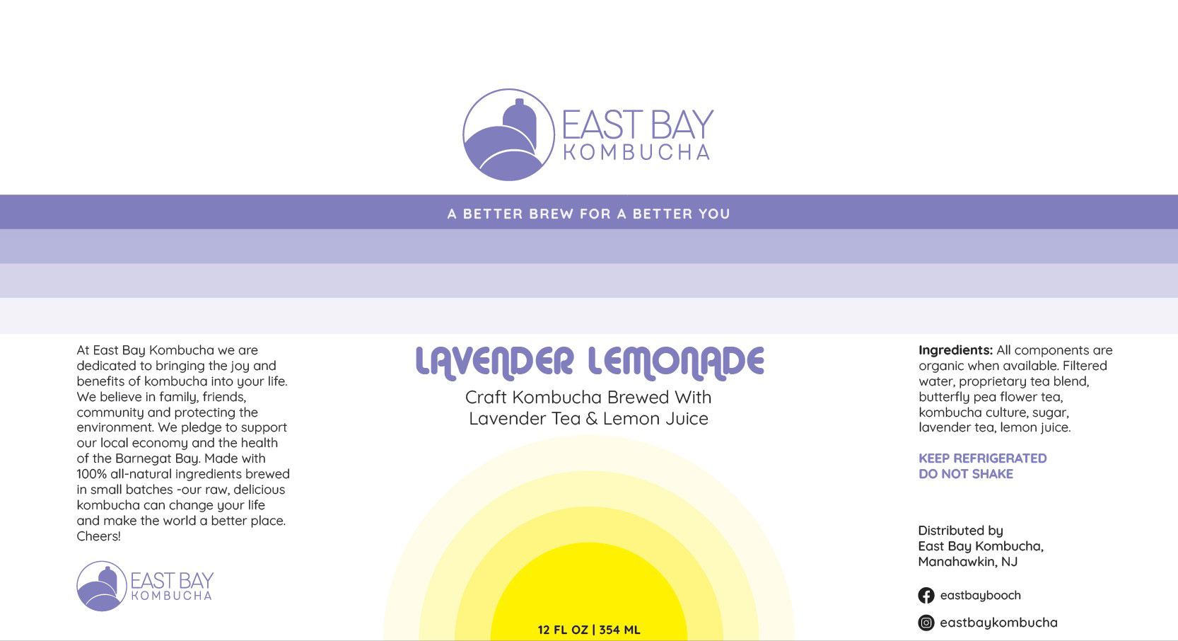
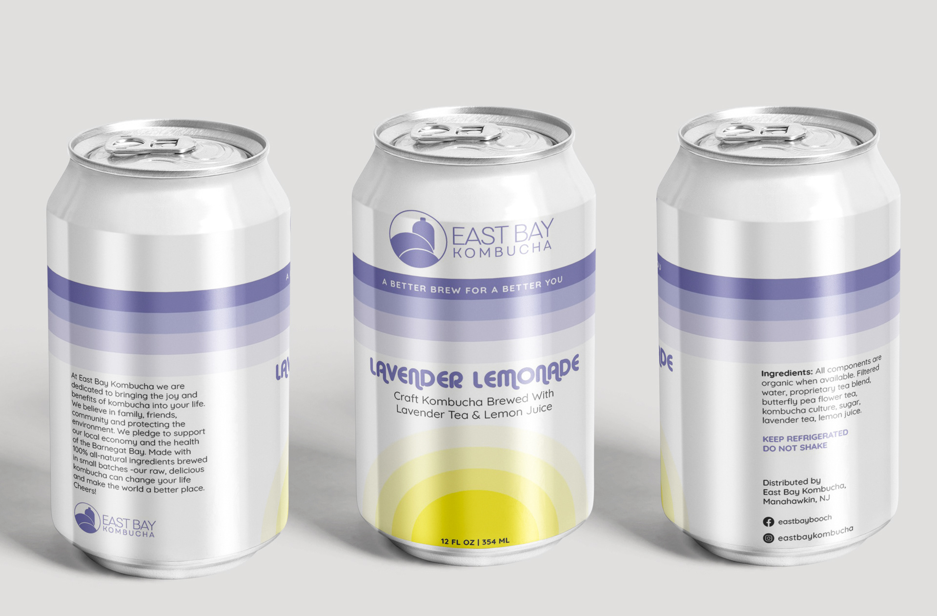
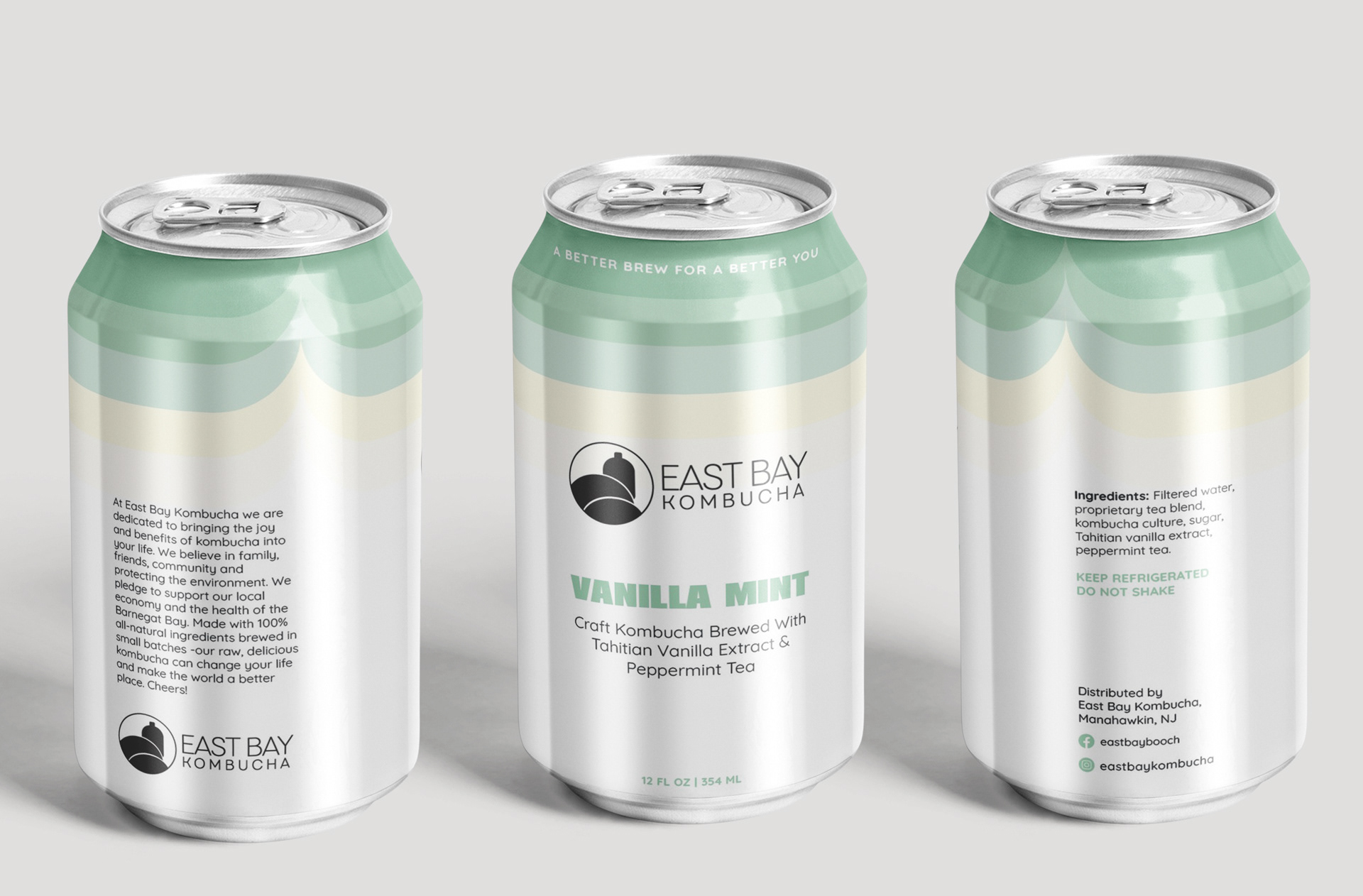
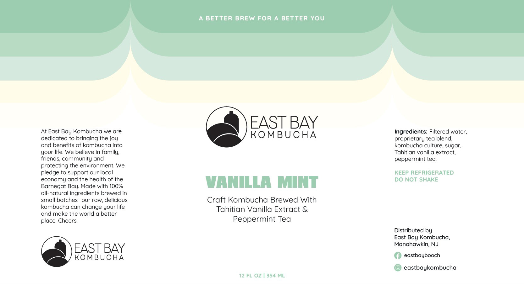
The client was really happy with the concepts.
"These are so, so incredible and exactly what I'm looking for. I love every one and it will be very difficult to choose. Thank you so much for really listening and putting my ideas into reality. My immediate thoughts are that I like the Cherry Rose concept best with the Pineapple Ginger a very close second. - but I also really love the Lavender concept with the setting sun. " Heather Committee
This is the completed product line
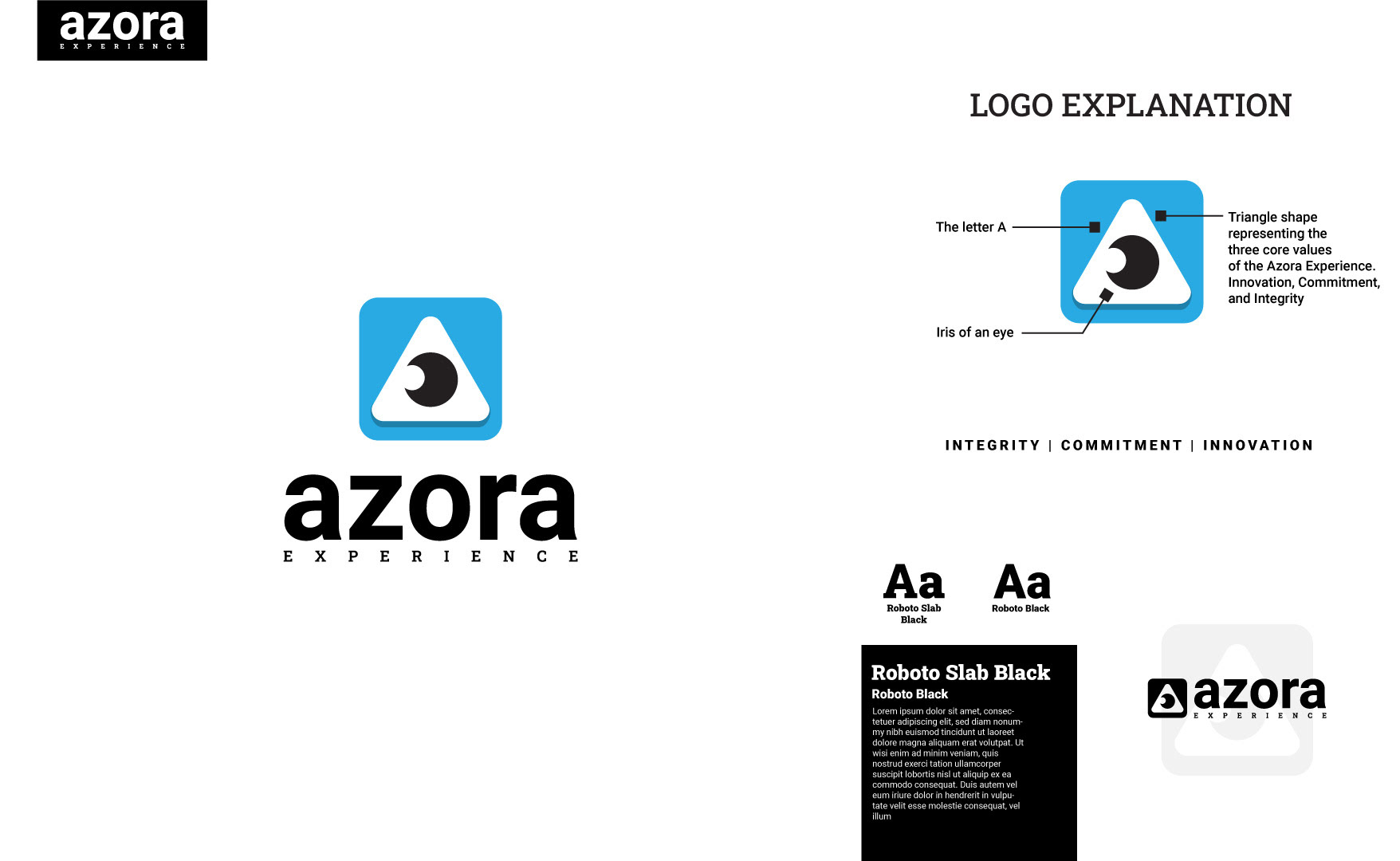
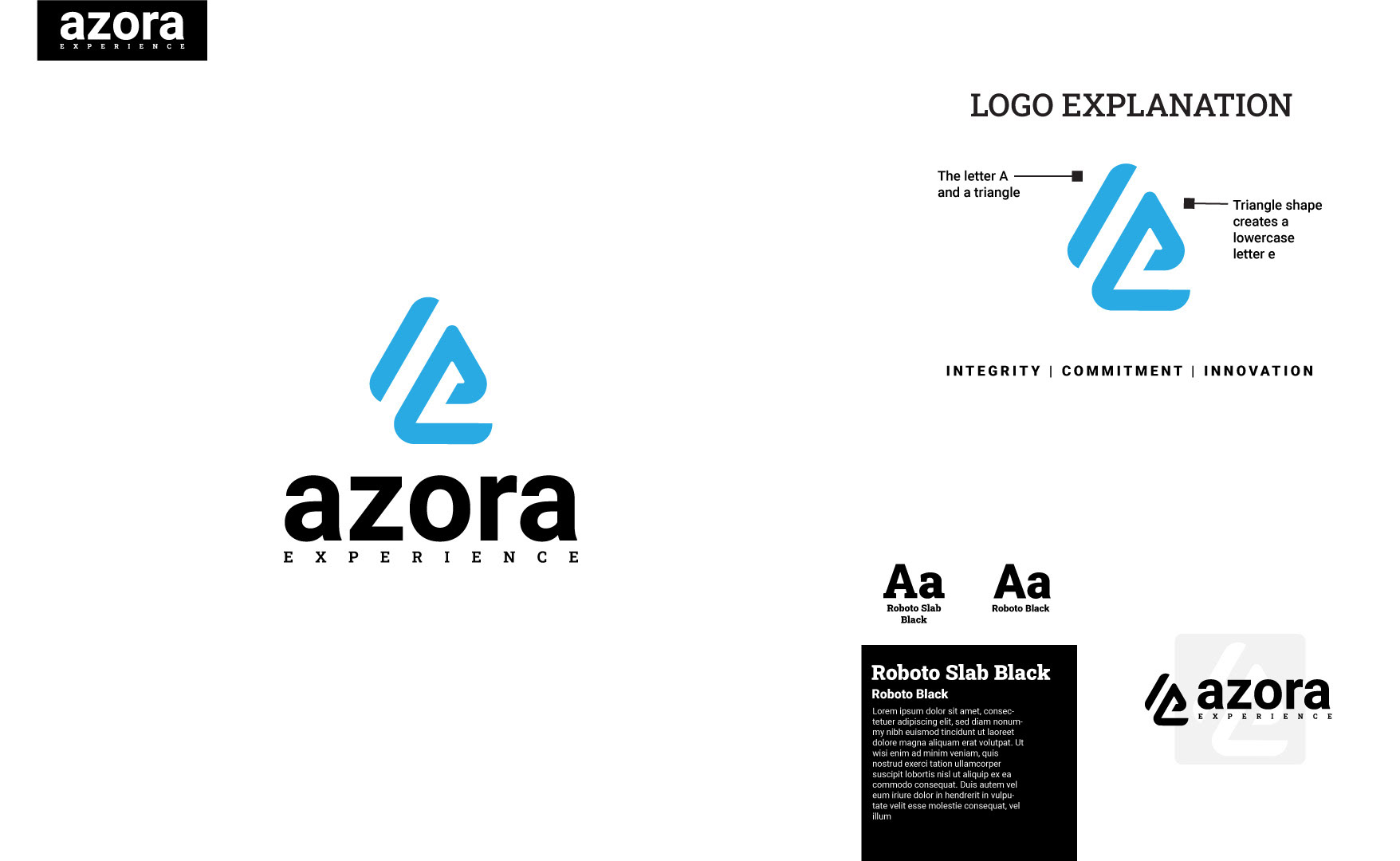
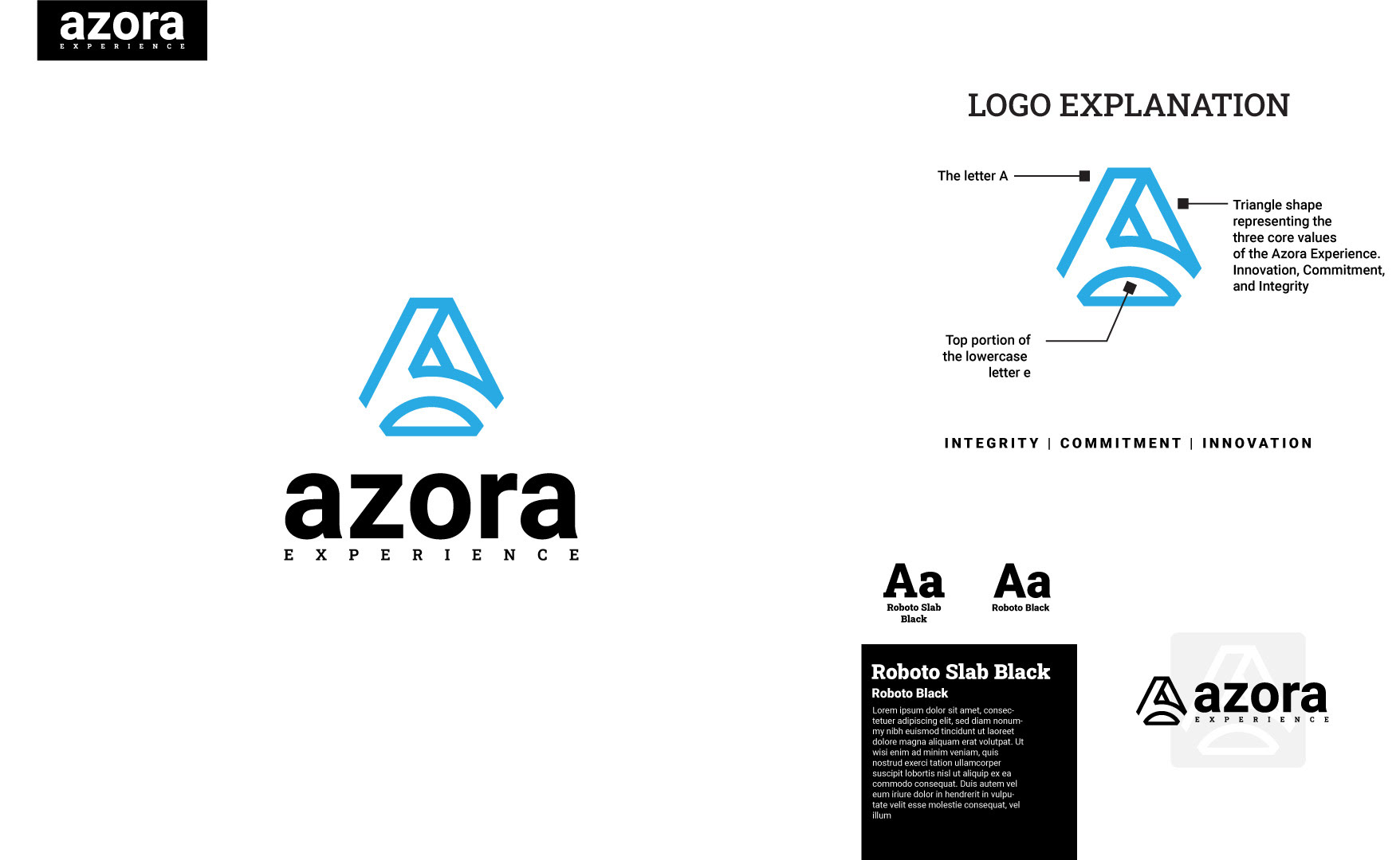
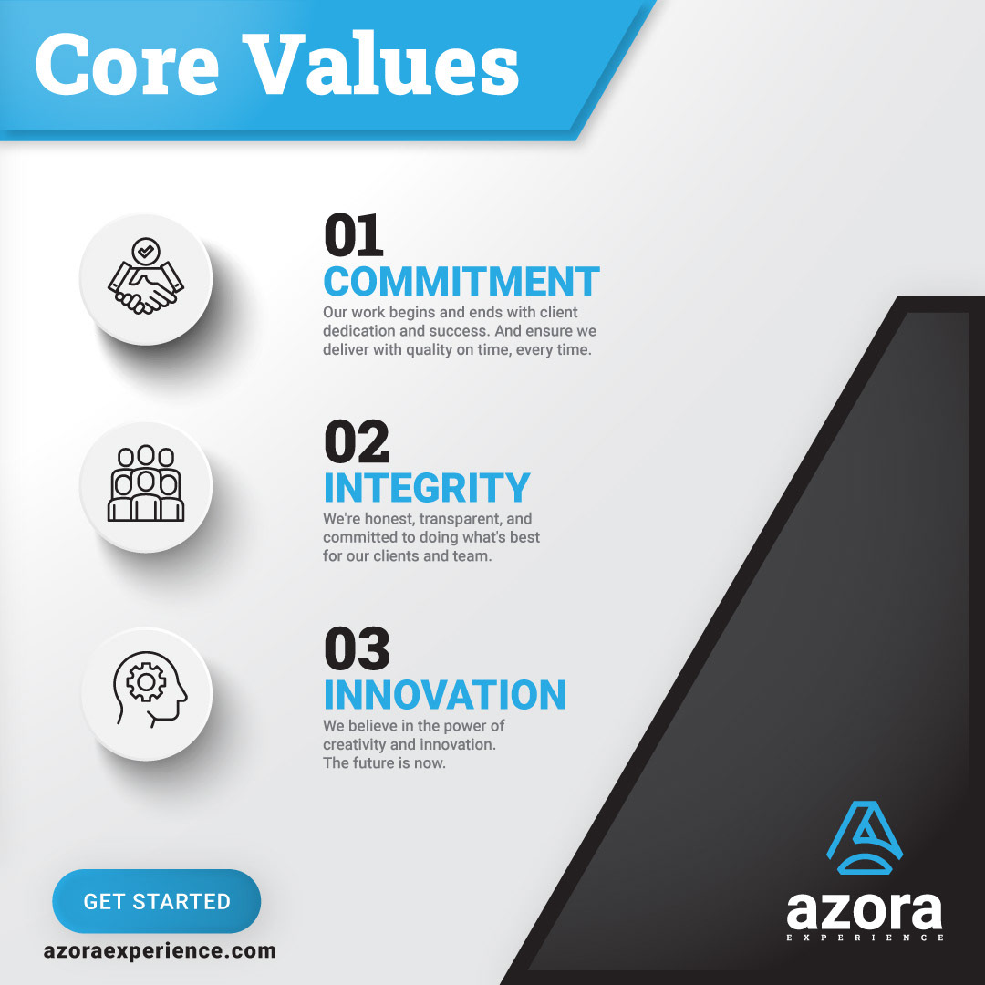
One of my first projects, when I started working with The Azora Experience, was a rebrand. You can see the complete brand standards here on my website.


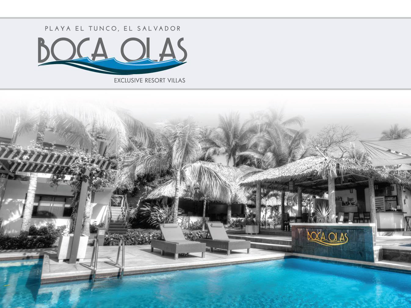
These three concepts were for a client's vacation rental. The client liked all three logos so much that he bought all three and repurposed them for different brands. It's nice when no concept goes unused.
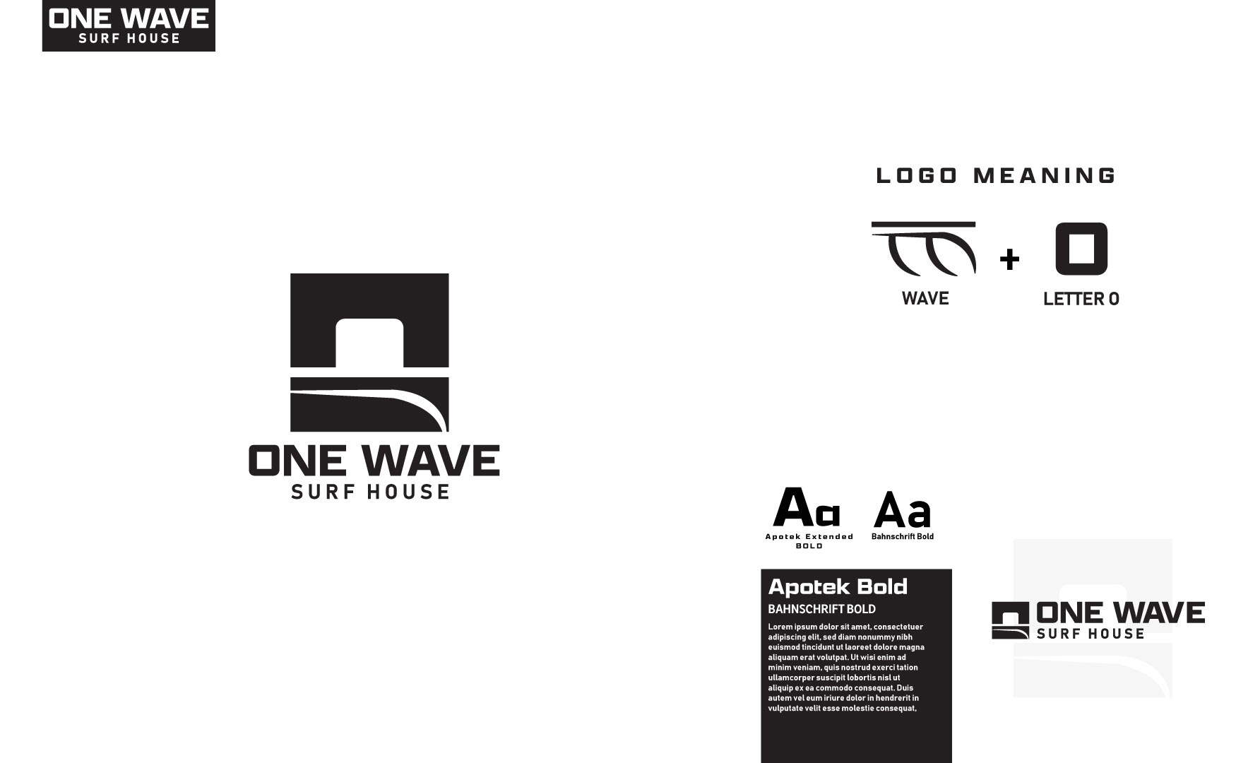
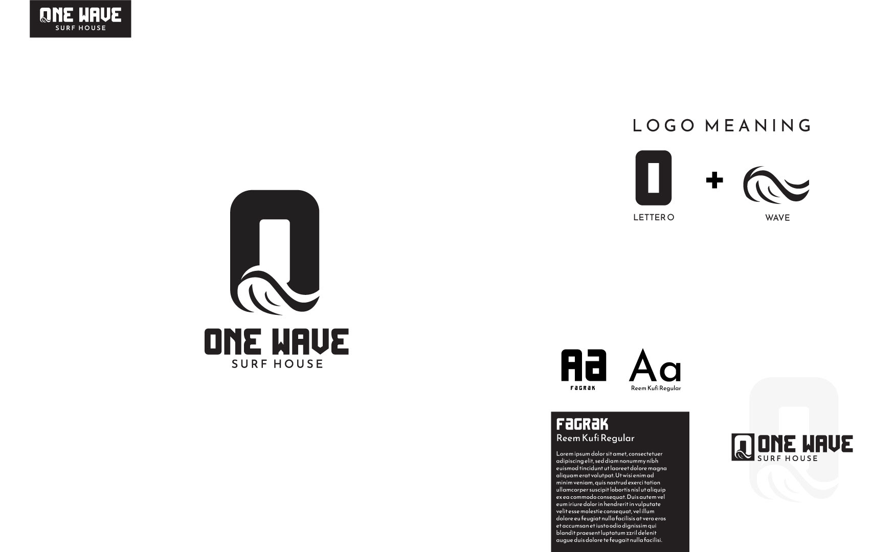
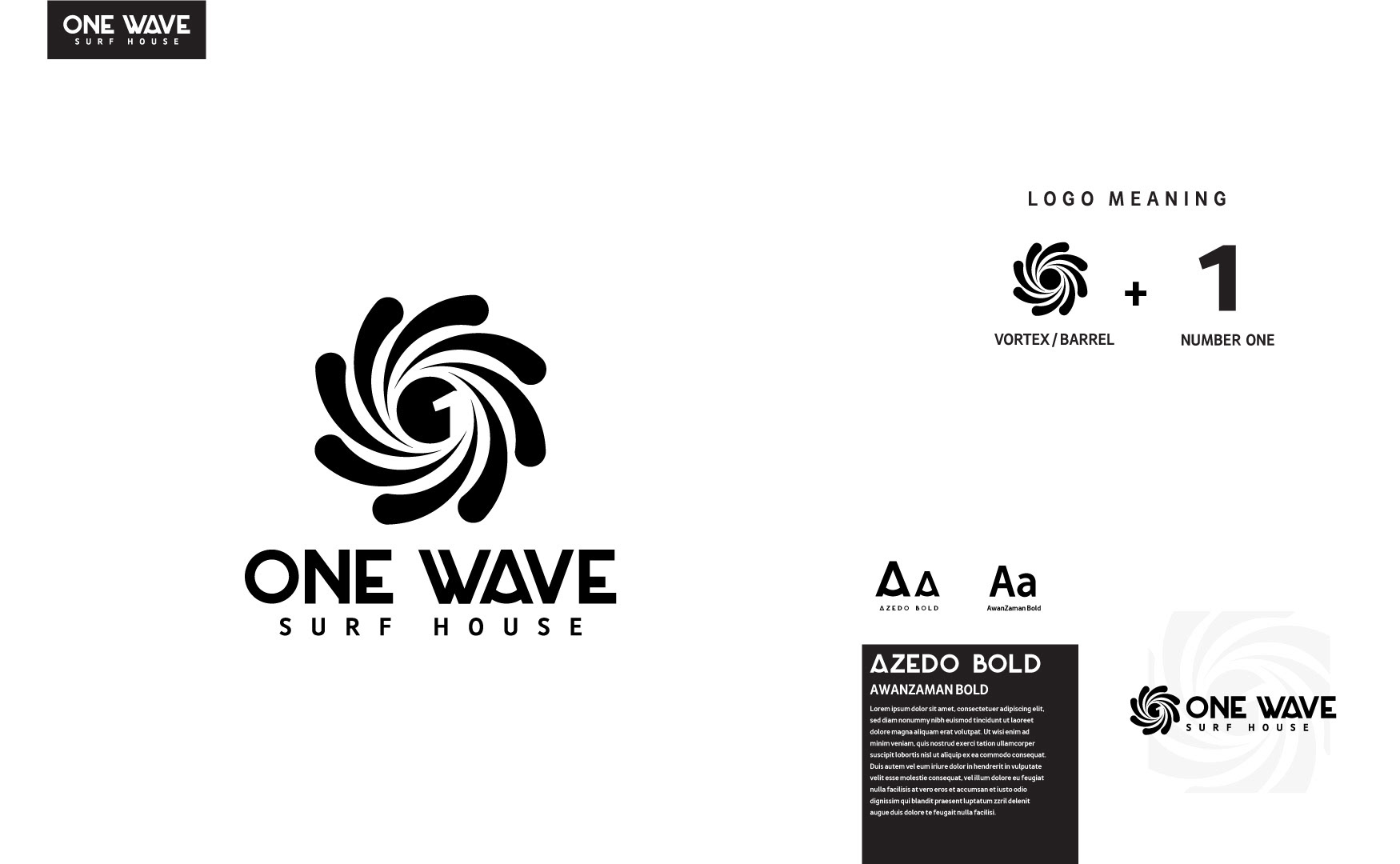
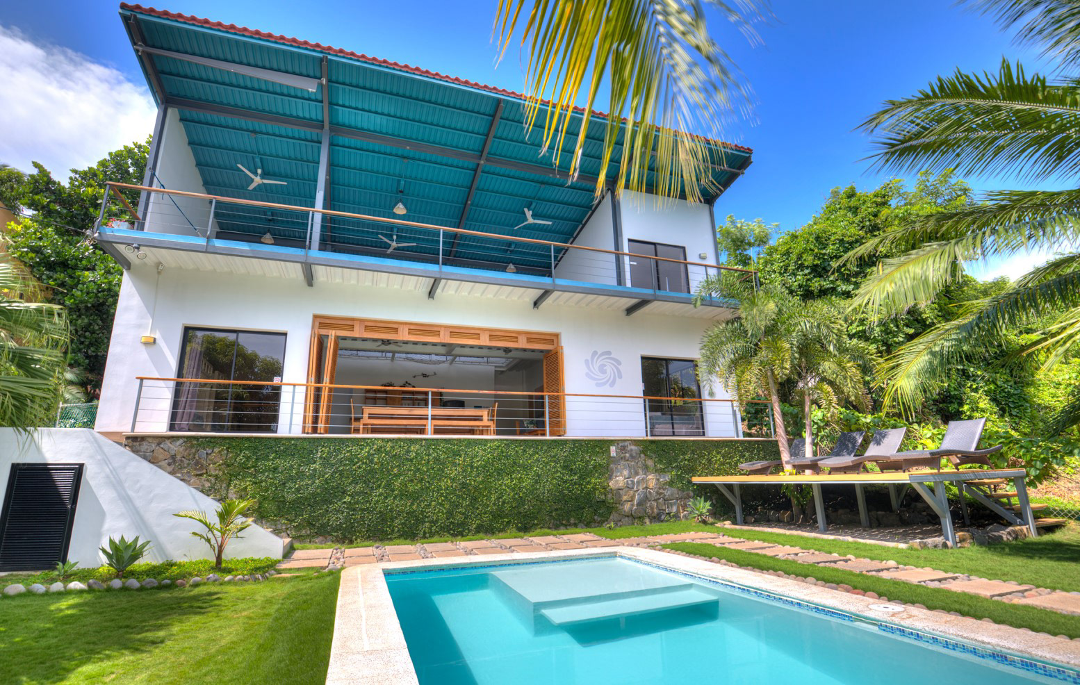
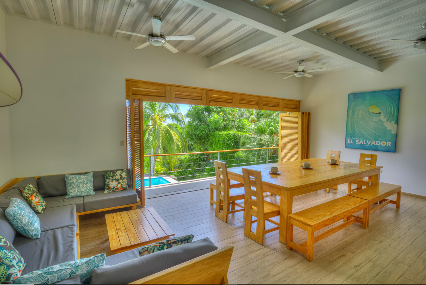
The One Wave Surf House is a vacation rental on the coast of El Salvador. The logo that was chosen by the client has a number one placed inside the tube of a wave but that shape also hints at the roof line of a home.
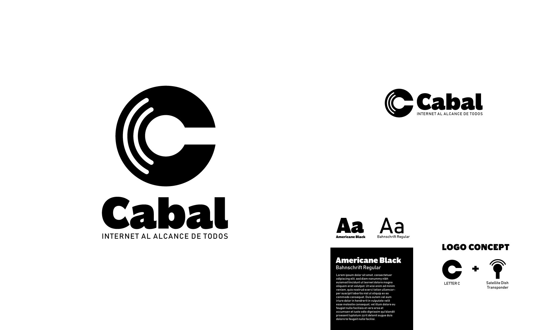
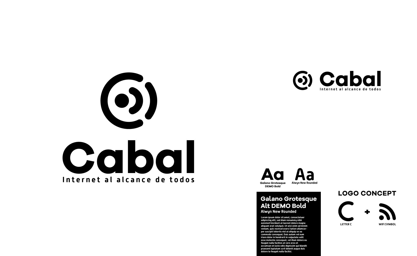
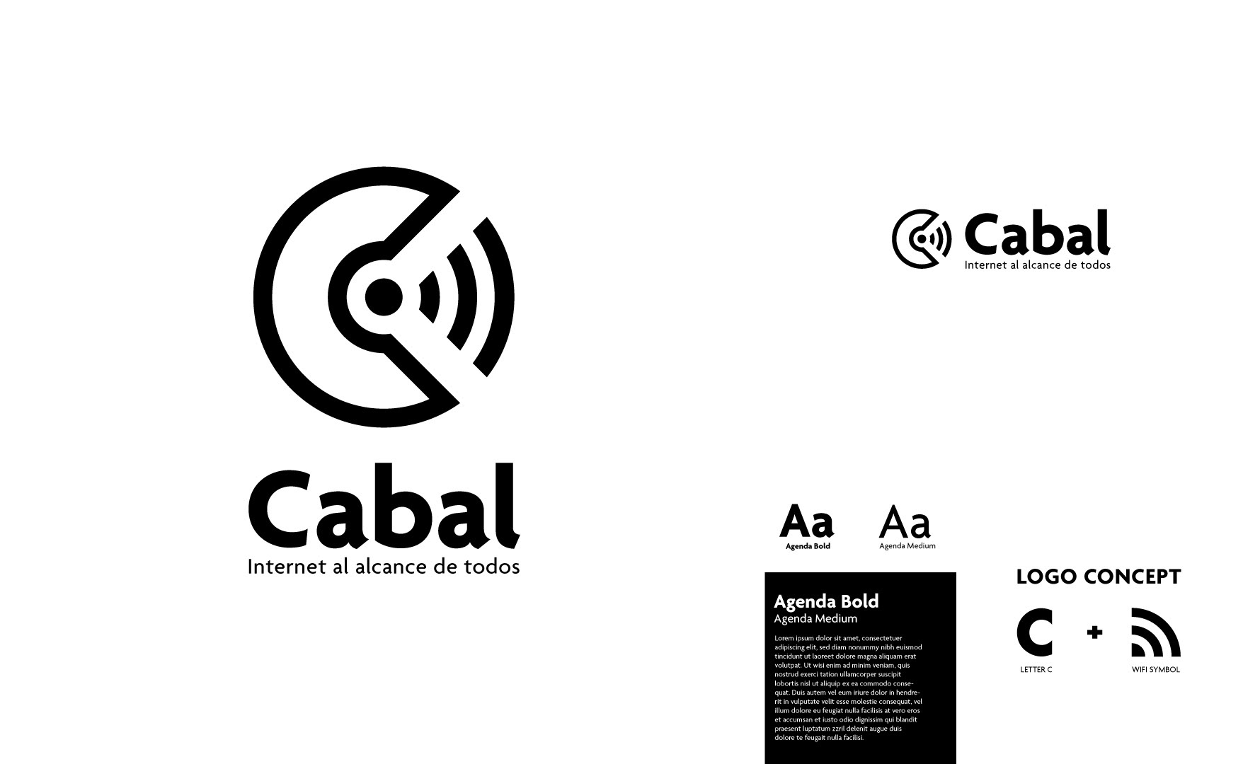
An associate of mine who created a very successful Ski Brand and then who moved on to work with Adobe and Microsoft decided that he wanted to create a new internet service in El Salvador. This is the branding package I was hired to create for that brand. Cabal is a slang term for equal. His idea was to market to the many disenfranchised communities that had largely been overlooked by the other ISP's operating in the country. Cabal, Internet that works for all.
